Features:
Why web accessibility matters to me
Making the web more inclusive for disabled people isn’t only the responsibility of disabled journalists, designers, & developers

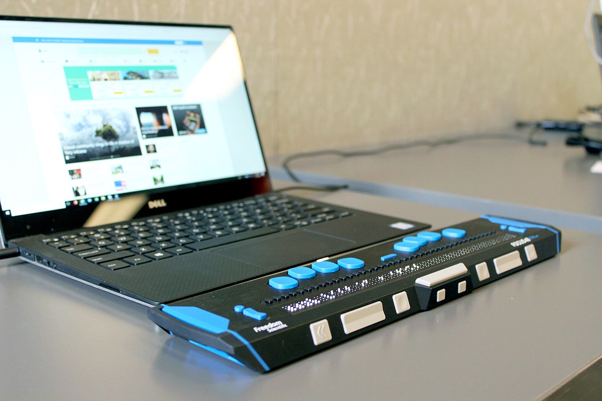
Blind and low-vision visitors may use screen readers to access your websites, or other assistive devices like this refreshable braille display. (Photo by Elizabeth Woolner on Unsplash)
Editor’s note: Aditi created “A starter pack of accessibility resources” to accompany this essay. You can find a lot of learning tips there, as well as in recent articles by Hannah Wise on how editors can make disability visible in news, and Patrick Garvin on writing effective alt text for journalists.
On a bright winter day in 2015, I walked into my 300-level computer science class and saw attendance was noticeably lower than usual. We were in the middle of a short series of lectures on front-end development, and that day we were supposed to learn about UX design principles and web accessibility. As a sophomore journalism major and mostly-self-taught coder, my impostor syndrome skyrocketed as I looked around the classroom and asked myself: Does everyone else know about this stuff already? Am I just late to the party? Or do they think it’s not important? Is it more of an elective skill than a fundamental one?
There could be a hundred different reasons why fewer students showed up that day—7 years on, the details are blurry. What has stuck with me over the years was that feeling of concern. As a journalism student I wanted to share stories to as broad an audience as possible, and in the age of Snowfall I thought interactives were my way forward. But what was the use if a significant part of the population was excluded from that kind of news experience?
More than 1 billion people in the world have a disability. Per India’s 2011 census, there are 26.8 million disabled people in my country alone. I am not disabled, so for the most part, I move through a world that was designed around my level of ability. Because I can’t speak from personal experience, when I get to talk with other people about why web accessibility is important in our line of work, I often turn to a list of reasons I’ve heard over the years:
- 1 billion people is a very large number for an audience whose news needs aren’t being met sufficiently, or at all. It’s an untapped market.
- Adding alt text to images can help boost SEO.
- It’s a legal liability; people could sue a company if its website isn’t accessible.
- It’s helpful for everyone, not just disabled people.
- Non-disabled people are just temporarily able-bodied or non-disabled; any person–including me–could develop a disability at any point in their lifetime.
- It’s the right thing to do.
I don’t think there’s anything wrong with any of these reasons, especially if you’re persuading someone with control over resources or priorities to invest in accessibility. But here’s why I really care:
- It IS the right thing to do. The group of people who have the resources to build things for the internet are a small subset of the much larger group of people who consume the things we make. That access comes with a responsibility to make things that people across a spectrum of ability can use and, at the least, not cause harm in the process.
- This is even more important for those of us in the news industry. We need to serve our audiences better, and for that we need to understand how to design and build projects that meet readers where they are and that are compatible with any assistive technology or devices they may use.
- It is true that anyone could develop a disability for many reasons—an accident, an illness or medical condition, old age, etc.—and that designers and developers should keep this in mind when building products that are meant to have longevity. Resources like Microsoft’s Inclusive Design toolkits recommend thinking about accessibility in a broader context; a person with an amputated arm and no prosthesis may have a similar experience navigating a phone or device with one hand as someone whose arm is in a sling, or someone holding a bus handle. It is useful to make our work accessible to as many people as possible.
However, not all disabilities have a temporary or situational equivalent that otherwise non-disabled people might go through. Moreover, even two people with the same kind of disability may not have the same experience; one may have access to resources like assistive devices, while another may have multiple disabilities that have a compounding effect on their life. We need to make sure that as we try to make our work more inclusive for all users, we still address the needs of the disabled users that accessibility standards were made for in the first place.
From theory to practise: what I learned from testing my own work
Since my introduction to web accessibility in that college lecture, I’ve been fortunate to have opportunities to learn more through internships and work experiences. At the Boston Globe, I learned it was possible to write a test in your code to block a project from publishing if it was missing alt text. At NPR, I worked on accessibility audits and user-research surveys with disabled audience members. I practised writing descriptive alt text and including it on social media posts, and tested colour combinations for my graphics and pages to make sure they passed colourblindness tests.
One of the things that has stuck with me during my accessibility education so far has been understanding the impact of my own work and how inaccessible it can be. The lightbulb moment for me was hearing what a page I had made sounded like on a screen reader.
Screen readers are one of several tools blind or low-vision people may use to interact with web products, and as the name suggests, they read aloud the contents of the screen and help people interact with it or navigate. Some, like VoiceOver (Apple) come pre-installed on users’ devices, some are free to download such as NVDA (Windows), Chrome’s Screen Reader browser extension and TalkBack (Android) and others are paid, like JAWS (Windows). There are many videos available online of people going through webpages using screen readers, but if you’re not used to using them yourself, you may not fully grasp how frustrating it is to encounter a website that isn’t built to be compatible with one.
One day, I learned a few VoiceOver navigation keyboard commands and tried to go through a simple test page I made. One of the first items on the page was a logo, built with an image inside a link. I hadn’t included an alt attribute for the image because I thought it was just decorative, and I had learned that only images that give useful information to the reader should have alt attributes. But when I heard what sounded like a keysmash, I realised that because I left out the attribute altogether instead of leaving it blank, the screen reader was reading out the filename of the image instead.
Here’s a recreation of that problem that shows a logo link with three levels of alt text and the code behind it, and what VoiceOver reads out for each one. The first logo has no alt text, so VoiceOver reads out the image filename in its place. The second one has an alt attribute but since it’s blank, it reads out the link instead. The third one has the alt text needed to tell a reader what the link is. There are guides available online that can help you write alt text for elements such as image links, data visualisations and photos.
How I’ve approached my own accessibility education
Part of learning more about web accessibility has meant learning more about disability itself. This might seem extremely obvious—it definitely seems that way to me now! But when I first found out that there were things I needed to fix about my code and design process, I went about it the same way I learned to code—a bit of haphazard googling and going with the solution that appears most commonly among the search results. I jumped headfirst into implementing solutions with a fairly shallow understanding of what I actually needed to accomplish.
I’ve spent the past year trying to course-correct by making an active effort to learn more about disability: from learning about different kinds of disabilities, to studying multiple models of understanding what disability is, to the long history of the disability justice movement and beyond. It has been humbling to identify and reshape what I now know are ableist assumptions of what disability is and how it might affect someone. I used to think that a disability was just something someone “had,” like an amputated limb or a health condition they were born with.
Now I realise that it can describe what a person experiences when they navigate a scenario that wasn’t designed with a range of abilities in mind. I also used to think that blindness, low vision, and being legally blind were more-or-less interchangeable terms. Now I know that the terms blindness and low vision encompass a wide range of conditions involving how far and how clearly someone can see. Legal blindness is more of an administrative category that can help someone access resources rather than a description of their actual abilities.
Very little of what I’m learning about is new. It is information that is widely available and that disabled people and allies have been sharing and talking about for ages, and non-disabled people haven’t always been listening or paying attention. It’s a privilege for web accessibility to be a topic of interest for me, rather than a personal and immediate necessity.
Making news and information accessible has always been important, but in the middle of the “mass disabling event” that is the COVID-19 pandemic, it is even more crucial. People rely even more on digital services and platforms to do things they could have otherwise done in-person, and with that might come accessibility hurdles they would have avoided. Users with low vision or blindness may face issues if information updates are shared as images without alt text (looking at you, WHO and CDC Twitter accounts), and at-home testing kits are designed for people with the visual and motor skills to use them. COVID-19 “long-haulers” who have persisting symptoms such as fatigue or brain fog may only be able to take in limited information at a time, which can make navigating the web more taxing.
The stakes are undoubtedly high. But don’t let this daunt you. The vast process of making the internet more accessible is made up of lots of smaller tasks such as using semantic HTML with ARIA attributes, including transcripts and closed captions on audio and video, making buttons and menus with large touch target sizes, and more. Start with one goal, like using a colour scheme with a strong contrast, learn how to achieve and test for it, and wrap it into your projects moving forward. One of my personal goals is to make sure what I’m learning informs my story ideas too, and not just the way I approach design and development.
Disabilities can be complex and fluid, and a single website likely won’t be accessible for every kind of ability level on the spectrum. But you can do a lot more than you think with the resources and skill sets you currently have on hand—and if you need somewhere to start, I made a list of learning resources you may find helpful!
Credits
-
 Aditi Bhandari
Aditi Bhandari (she/her) joined Reuters as a data visualisation developer in 2019. She has previously worked at the Hindustan Times and interned at several U.S. newsrooms after graduating from Northwestern University in 2017, where she was a Knight Lab student fellow. When she’s not researching web accessibility or good-naturedly cursing the inventor of [insert programming language here], she’s either watching food documentaries or listening to pop-culture podcasts.


