Features:
Visually Explaining a Bombing and Its Aftermath
Interactive multimedia features from five newsrooms

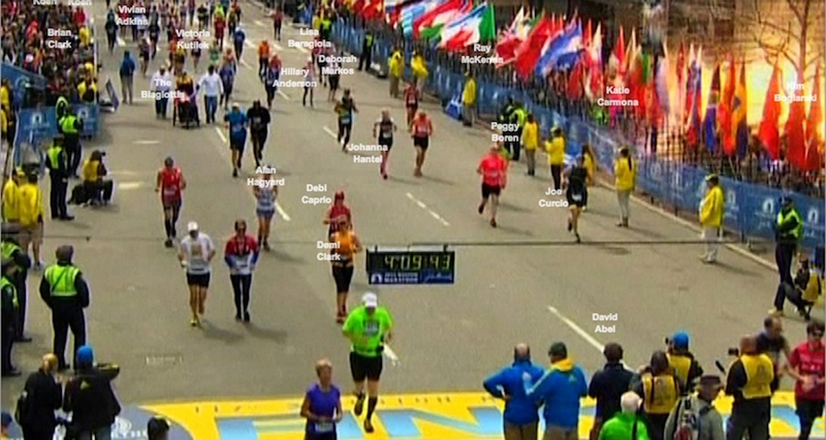
From 4:09:43, the New York Times’ feature on the Boston Marathon runners after the bombing (photo: NBC)
After the bombings during last week’s Boston Marathon, newsrooms in the US and UK produced interactive maps and features to help their readers understand the locations and chronologies of the bombings themselves, the ensuing medical treatment of victims, and the hunt for the bombers—and in the days that followed, to collect and communicate the stories of the victims.
In this post, we collect the work of five newsrooms—the Boston Globe, the Washington Post, and New York Times, the LA Times, and the Guardian—and explore the maps, timelines, diagrams, and other visualizations they used.
The Explosions
During the very early hours of April 16th (US Eastern Time), the Boston Globe used a street map and series of satellite photos to produce a simple series of responsive diagrams and an visual timeline of the explosion site and the Guardian created a step-by-step series of maps of the initial events.

Maps from the Boston Globe (L) and Guardian (R)
Late that evening, the team at the New York Times created a detailed reconstruction of the crime scene in Boston, using 3D and flat maps as well as photos and video from the event.

The New York Times’ 3D diagram of the explosion sites
As part of their multi-part interactive multimedia feature breaking down four days of events in and around Boston, the Washington Post also published a series of diagrams of the explosions, beginning on April 15th.

The Washington Post’s map and diagram
The Suspects and the Manhunt
The LA Times created an interactive map/timeline of the hunt for the bombing suspects.

The Los Angeles Times’ visual timeline of the hunt for the suspects
The Washington Post added diagrams and multimedia on the suspects and the manhunt to their multi-part feature and the Boston Globe created a visual timeline of significant moments and places in the lives of the bombing suspects.

The Washington Post’s visual coverage of the manhunt and investigation
The Victims and Their Care
On April 17th, two days after the attack, the Boston Globe published a multimedia feature on the emergency medical treatment of the bombing victims, including diagrams of the medical tends and teams.

The Boston Globe’s diagram of on-site emergency medical care for the bombing victims
One week after the bombings, the New York Times published 4:09:43, an interactive feature connecting an iconic photo of the marathon and first explosion with the stories of individual runners, using video, text, and photos.

From the NYT’s feature on the marathon runners
Edited to Add

From Boston.com’s Tell Your Stories interactive video feature.
The Boston Globe also published two community-focused interactive features on Boston.com: Boston Marathon Bombings: Your Story and The Complete Bombing Video: Tell Your Stories. Thanks to Gabriel Florit and Andrew Ba Tran for sending them in.
The AP also created a responsive, four-part series of interactive features on the bombing and investigation, the first parts of which went up the day of the bombing. Thanks to the AP’s Nathan Griffiths for the tip.
Credits
-
 Erin Kissane
Editor, Source, 2012-2018.


