Features:
SRCCON: Human-Driven Design
Ryan Pitts and Sara Schnadt on how to know your users and build just what they need

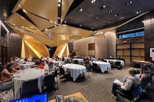
Last week at SRCCON, OpenNews’s own Ryan Pitts and Sara Schnadt from Census Reporter ran a highly participatory session about human-driven design. They started by laying out the design process that led them to the Census Reporter product as it stands, and discussing the design principles that helped them stick to their process over the course of 15 months.
What Pitts meant by process, he explained, is “a framework you identify in advance: these are the steps we’re going to follow to figure out what product we’re going to build.”
Building on his experience with fellow board member Joe Germuska on the PANDA project, they borrowed a simple process from Brian Boyer:
- Who are our users?
- What do they need?
- What could we build?
(The first two steps are where personas and needs-finding work comes in.) They found it “a nice, simple memorable framework” a team could get through in an afternoon. In the case of PANDA, it was a day-long exercise. With Census Reporter, it was a longer research process.
Schnadt did the research, and began by surveying the NICAR list to gut-check her assumptions and ask people if they would be willing to speak one-on-one. She had in-depth conversations with 13 journalists in all, and learned they had four kinds of users: journalists, data journalists working a beat, journalism nerds, and software engineers and app developers. She learned how each group tended to think and process information. Some were more narrative-focused, some more structural, some more visual—and all three needed to be addressed in the interface. She also analyzed articles to find out what she could glean about the skills people had in small versus large newsrooms, individuals, and teams. Did they want a data point for a story? A really nice shapefile? All of that went into the personas so they could speak their users’ language and have a clear picture of their needs. That was Census Reporter’s roadmap.
The team identified the principles they wanted to follow in developing Census Reporter:
- Make it exploratory—users get more back than they expected (especially newbies)
- Make it powerful and functional for power users
- Develop circular navigation structure to support exploratory behavior
- Keep the navigation structure simple because the data is complicated
- Make it visually appealing to draw in wide range of users
These were hard to balance: keeping the interface simple but informative and comprehensive; making it so that inexperienced users and experts both get good stuff out of it.
The Census Reporter team identified two main types of information their users would be looking for: there are “the facts of a place” meaning, for example, facts about your town, and “the places of a fact,” which is information that’s useful when your beat is a topic rather than a place.
All of this work came before they brainstormed features. As Pitts put it, “You don’t build features, you’re actually solving problems. You don’t want to end up building features in search of a problem.”
They built iteratively and were able to show users very early prototypes to get feedback as they went along. They showed it at conferences and got in-depth feedback at ONA. When they heard from users that they wanted to know other things than what the tool was offering, the team took it seriously. “Just because you spent time on it doesn’t mean it should be there. Your users are precious but your ideas are not.”
Trading Ideas
Opening up the conversation to small breakout groups, Pitts and Schnadt emphasized that every project is different, and that they had had the luxury of time. But even for quick turnaround projects, “there’s value in seeing how other people work, because some principles can be plucked and applied to your own situations.”
The breakout groups came back with reports on the processes, ideas, and questions they work with. Many noted the discrepancy between their ideas of what’s good practice and their own actual behavior as designers and developers. “Why don’t we do this more often?” was a consistent comment.
One advocated “Getting out of your bubble and going into the newsroom, throwing something on someone’s desk, asking: how would you use this? That speaks to having a diverse staff too.”
“Put somebody in front of your work. Whether it’s structured or not. Make the effort to put somebody in front of that work. Seeking out feedback early and often is really important.”
A participant suggested that when things are moving too fast, you can substitute looking at analytics for user research. There are lessons you learn for next time you do something similar.
The idea that there may be two good paths and you’ll be forced to make opinionated choices that cut out some users got a lot of agreement from the room.
One team talked about how they ask themselves “is this interesting to anyone else besides us? Are we asking people to do too much?”
A participant commented that it’s important to remember that nobody reads instructions. Another, who works with customers, pointed out that if nobody’s reading your instructions, there might be something wrong with the instructions. But also that with a product, often to get instructions, people have to context-switch from one part of the product to another, and that’s asking a lot.
A participant from an organization that does highly structured testing pointed out your checks don’t all have to be technical just because it’s technical stuff. They do rapid prototyping with users drawing things on paper with crayons. “It takes twenty cents worth of material and ten minutes.” She also invoked the “Your Aunt” test. “Show what you’re doing to a normal person. Are they hearing what you think you’re saying?”
See the session leaders’ notes for more!
People
Credits
-
Kio Stark
Independent education activist, Source Learning editor, ITP adjunct. Author of Don’t Go Back to School and Follow Me Down. Also obsessed with: relational tech, streets+strangers, cities, brains, stories.


