Features:
Reported.ly’s Editorial—and Web—Evolution
How reported.ly tinkered its way to a home for social-first journalism
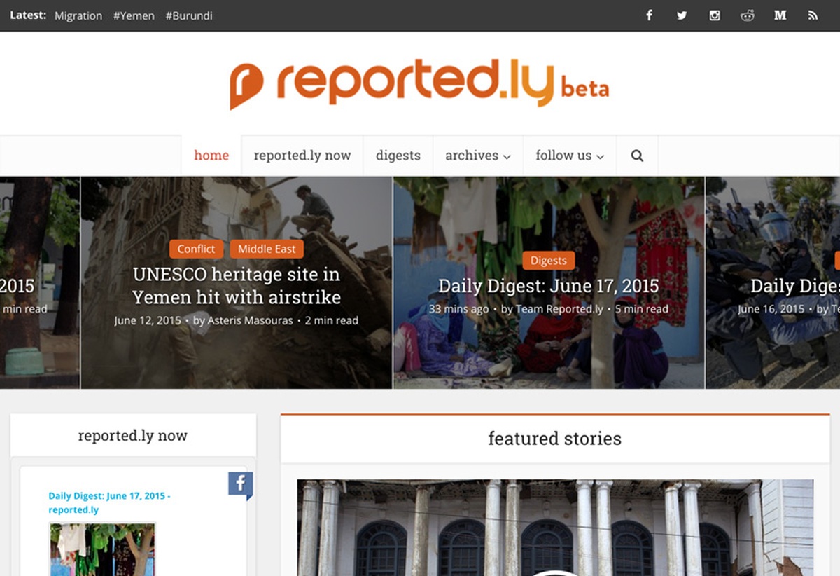
The reported.ly beta website
Reported.ly’s first website went live late last month, and it represents the lessons that we’ve learned—editorially and technically—since our launch at the beginning of this year.
Our team of six journalists is spread across ten time zones, and we built our site while also focusing on our day-to-day work of social-first reporting. And whereas in some newsrooms, product is separated from editorial, our small staff wore both editorial and product hats. Everyone at reported.ly participated in this project, from site conception to bug hunting, and this is how it happened.
Evolution of a Concept
The first time reported.ly team members met, a few weeks before we officially launched in January, several of us hunkered down to talk about what we wanted to build, product-wise.
We came away with a list of problems to tackle, all focused on how we preserve and publish our work when what we do is ephemeral. For example, almost everyone in the room had struggled with referencing prior work—it’s hard to connect of-the-moment bits of social content over longer stretches of time.
Whatever we built, our first priority would be working with users on social platforms to tell stories with them, open-notebook style. Our work emphasizes highlighting and verifying stories from social media, but we also wanted a site that would allow us to produce deeper feature stories—still with social platforms and users in mind—and integrate content from multiple platforms into a single story.
We also assumed many potential users might not be able to follow along across multiple social platforms—not everyone is wired for high-speed, real-time coverage—so we needed a space to show our work over a period of time.
The First Iteration
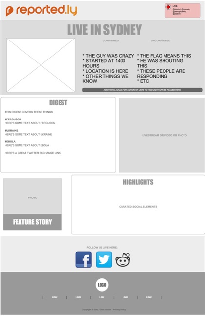
Early wireframing
Our first wireframes depicted what we often describe as reported.ly’s editorial “gears,” like the gears of a bicycle:
High: When a breaking story emerges and we need to narrate the story through real-time social media curation.
Medium: Daily recaps gleaned from the editorial pass-offs we write to each other as shifts change.
Low: Long-form, explanatory stories and feature stories that are less time-sensitive, or are built from the work we’ve done in faster gears. For a time, we used Medium for this because of its focus on design and layout.
Using the wireframed ideas, we worked on a first iteration that gave us a simple way of creating these gears or modes without detracting from our reporting: a simple dashboard that displayed our latest work across gears.
Challenging Original Assumptions
As reported.ly’s work matured over its first months of reporting, our vision of the site evolved with it—and eventually we paused to make sure our concept, and what we now knew editorially, fit. We challenged each of our original assumptions and ended up slightly rebooting.
Our site still needed gears, because we routinely shifted from covering something fast-paced like a terrorist attack to something slower, like the European migrant crisis—often in parallel on the same day.
But instead of merely assembling a disparate collection of social media elements, we saw our story lines evolve and grow over time. We needed the site to capture that storytelling process, while making clear what news events were dominating the moment.
The rethink was a challenge for me both as a news producer and as the site’s project manager. With our deepening understanding of our editorial work, the simple idea of a “dashboard” of the latest social media bits had grown into a full-fledged site—so the design and layout had to grow with it. And not everything we’d planned made the cut for the site beta, including a number of ideas we loved.
When Editorial Runs Product

An interim site design
When you build a website as you’re just learning what your organization does, it is much tougher to stick to initial requirements than if you’re an established news brand. As we better understood the type of journalism we wanted to produce, the feature requests piled up.
To get it all done with our small, multi-functional staff, we split up oversight of the various concerns. Malachy Browne, our managing editor, minded workflow and kept us honest about what was and wasn’t possible to produce. I kept an eye on overall look and feel, while editor-in-chief Andy Carvin watched over our storytelling and how the site could push that further.
Our original wireframes gave way to new ones. We filled whiteboards with presentation ideas to capture our evolving editorial insights. We starting using daily scrums and sprintly to stay organized and on schedule. For testing, we used a Google Form to allow the rest of the team to submit bugs. I then funneled them into sprintly, which made it easy to organize our priorities.
For the CMS, we adopted WordPress and Iframely, forming a publishing backbone that allowed us to stretch our storytelling legs with ease, not unlike the experience on Medium. WordPress also lets us iterate quickly, and we know our storytelling will continue to evolve as we experiment.
Our editorial shifts have affected the site’s current concept in many ways:
Threading
Since Twitter will “thread” together a series of replies to each other, we started threading our own tweets when covering a particular topic. That way a user could easily discover all the other relevant tweets we’d written. It became clear that editorially, we didn’t put together disparate objects, and we weren’t just about curating. Just showing a tweet or two of a story wasn’t enough, we wanted to combine traditional writing techniques with social elements.
On a larger scale, social-first journalism is evolving from focusing on “storifying” social content after the fact, to mining social media and reporting in real time. We aim to be at the forefront of that.
Visuals
We also found ourselves creating more multimedia stories than initially expected. Some of these were incredibly popular, so we needed to be able to produce galleries on the site. Galleries hadn’t been a priority, but our staff and audience had fallen in love with them, especially essays that were a mix of wire photography and citizen photography. We also discovered that the videos we occasionally produced were becoming increasingly popular.
reported.ly now
A real-time, cross-platform aggregator we began calling “reported.ly now” was one of the most challenging aspects of the website. As anyone who has worked with social feeds knows, API limits were our worst nightmare. How could someone keep up with our latest tweets if Twitter only allowed us to refresh the feeds every 15 minutes? That’s an eternity to us. And in a breaking news situation, would we want reported.ly now to be more than our social feeds, incorporating some form of live-blogging into the mix?
In one of our last iterations in the final weeks prior to launch, we looked at reported.ly now and asked ourselves questions we had used each time:
- Do we need the full functionality we’ve envisioned for launch? Taking our editorial hats off, what would we consider the minimum viable product?
- In what instances will someone notice the difference between our dream concept and a product we’d iterate over time—and is that discrepancy okay with us?
- We moved many ideas for reported.ly now to the “someday” category, and determined what we wanted to track to see if those ideas were things our audiences wanted.
The Blessings of Tinkering
With the types of social-first reporting that reported.ly does, these challenges—“Do we really need it?” “Do we need it right now?”—have become a refrain. We often question our assumptions about how we work and what we produce, because they no longer make sense, or we’ve discovered a better way. Challenging our assumptions has led us to change the way we report as much as it has changed how we approach building a website.
We don’t use the word failure a lot. On the other hand, we do tinker a lot. Perhaps it’s our social DNA that leads us to this notion of constant iteration. If something doesn’t work out, we ask why and what we can change—either to fix it or to do something else entirely. That goes for the stories we produce and the products we build, which is why our values of experimentation and humility are essential to everything we do.
It was tough to set aside ideas that we had emotional ties to, but it’s helped us launch a better product that will continue to evolve with us.
Credits
-
 P. Kim Bui
P. Kim Bui is the director of product and audience innovation at the Arizona Republic. She’s focused her career on leading real-time news initiatives and creating storytelling forms for digital, print and broadcast companies catering to local, national and global audiences. Prior, she was editor-at-large for NowThis News, focusing on original, social reporting and breaking news. She was also deputy managing editor for reported.ly, a digital media startup specializing in social journalism. She’s been a speaker, trainer and teacher on leadership and digital journalism at universities, conferences and gatherings worldwide. She writes a newsletter for emerging leaders and managers, The Middles: themiddl.es

