Features:
News Development Roundup, Nov 16
The first of four collections from two weeks of journalism code

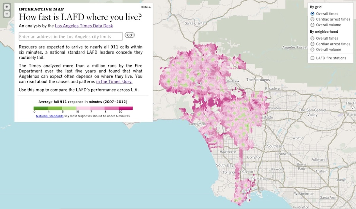
The LA Times’ LAFD response-time map
Next week on Source, we run a series of detailed examinations of election-related projects. As we head into the weekend and collect our wits after the Mozilla Festival, we offer a weekend-friendly rundown of the many projects from the last two weeks that have absolutely nothing to do with elections—some of which we’ll also be covering in detail next week.
The Los Angeles TImes

The Quiet LA base map, now open source
The LA Times Data Desk produced a beautiful interactive map (pictured above) that displays Los Angeles Fire Department response times and allows LA residents to check response times at their addresses, published alongside a story analyzing the causes of slow response in specific areas. This week’s interactive and story are part of an eight-month-long series on the LAFD. The Data Desk’s Ben Welsh and reporter Kate Linthicum did a Google Hangout about the story and the data behind it.
In conjunction with the new map and story, the Data Desk released Quiet LA, their muted base map of Southern California, as an open-source template (demo site), and did a write-up on how they made it and what they learned along the way.
Edited to add: Over at the View Source podcast, Dave Stanton has interviewed Ben Welsh about the making of the LAFD map, and about the larger investigation. The interview gets into some really interesting details about the story and its context, and touches on some of the internal tech aids Welsh made to support the investigation.
ProPublica

The Pipeline Safety Tracker in pipeline view
ProPublica’s Lena Groeger created the interactive Pipeline Safety Tracker map and wrote a single-byline explainer on pipeline safety and known incidents. The nerd team also produced a map and story on the dearth of hospitals in Lower Manhattan as New York continues to recover from Superstorm Sandy.
Also this week, ProPublica announced applications for its ongoing P5 pair-programming project, which offers journalists around the world the chance to spend up to a week with the ProPublica nerd crew, working on a news apps project of their own while soaking up the expertise of a working news development team. They also posted a writeup on the project’s first participant, Julius Troeger of the Berliner Morgenpost, which offers a sense of the program’s scope and flavor.
More Maps and Charts

Data visualizations on truancy from the Chicago Tribune
As part of its coverage of the aftermath of Sandy, the WSJ produced a map showing which NYC schools were relocated due to storm damage, and where students of those schools should report for class. WNYC’s Data News team produced a time-lapse GIF of their “Changing Trains” subway map, which is particularly awesome (and eight megs) when viewed at full size. Further west, the Chicago Tribune produced a set of visualizations as part of an investigation of truancy patterns among Chicago schoolchildren.
Finally, the Guardian’s indefatigable data team produced its usual giant stack of maps and charts, including an interactive map of the effects of government cuts on local authorities and councils.
News Dev Miscellany
The Seattle Times has made Lauren Rabaino its first-ever news app editor position. As homepage producer at the Times, Rabaino produced a series of cool news apps and visualizations in her free time, and started a “beta” tools and apps team in July of this year. In a conversation with Pando Daily, Rabaino noted that her team’s work would be evaluated not based on traffic, but on how many problems they solve.
The New York Times spoke with Nieman Lab about an internal language-tracking tool produced by its R&D lab, and at the Guardian Datablog, Google’s Kathryn Hurley wrote about her experience spending a week with the data team as preparation for her keynote at the Strata conference. Meanwhile, our own Ryan Pitts is collecting news-nerd wisdom and would like to include your mantras.
Organizations
Credits
-
 Erin Kissane
Editor, Source, 2012-2018.


