Features:
SRCCON Spotlight: Illustrating Investigations
Allison McCartney and Dolly Li on creating compelling visuals for abstract stories

This year’s SRCCON—our fourth—begins next week. To kick off the run-up to the event, we’re featuring a selection of sessions from last year’s conference, including transcripts and audio when we have them, and brand-new interviews with the session facilitators.
The Session
Many participants called out Dolly Li and Allison McCartney’s SRCCON 2016 session on illustrating complex, abstract ideas as one of their favorites of the whole event. Luckily, their session was also very well documented, so it was an obvious choice for our showcase of sessions from previous years.
Notes, Docs & Audio
From the session description: When stories have abstract topics, coming up with visual components can be a challenge. How the hell do you visually illustrate “borderless economies” or “Medicaid fraud?” Learn how to approach abstract stories from a visual angle and a step-by-step method for creating compelling visual assets.
- Session notes on an Etherpad
- Post on Medium about the session
- Session slides
- Facilitator outline
- Session audio
Q&A with the Facilitators
We caught up with Li and McCartney last week to talk about how their session unfolded, what kind of preparation they did to make it work, and what they learned from the experience.
Q. What was your session about, and how did you land on that topic?Our session was about how to create compelling visuals to convey abstract and/or complex news topics. We wanted to provide non-visual journalists with a guide and the technical language needed to better communicate with the illustrators and graphics teams in their newsrooms. We both have experience being visual journalists working with mostly non-visual people. We’ve found that certain tips, techniques, and exercises help facilitate greater communication and understanding between these teams.
Q. What was the session’s structure like?We started with a short intro talk (with a slideshow, mostly images). Then we gave examples of good and bad illustrations from other publications and discussed what was effective/not effective. After, we provided a list of tips for people to take back to their newsrooms to help facilitate more productive brainstorming sessions.
Finally, our favorite part, which took up the second half of our session, was all interactive. We started with blind portrait drawings as a warm-up and had everyone share their illustrations. This really helped break the ice and had everyone giggling because it neutralized the pressure of being a good artist. Most people are terrible artists when drawing blind so we were all able to laugh at ourselves.
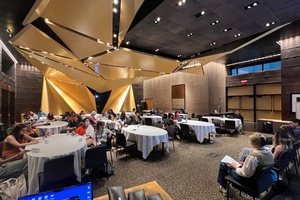
After that, we broke into groups (we had one to two teams per table) and had each group choose a fake headline from a hat (e.g.: “Pot Becomes Legal In All 49 States Except California”). Next, each group had a few minutes to come up with a few free word associations (i.e.: “What are the first things that come to mind when you read this headline?”). Afterwards, each group had to come up with two to three sketches for illustrating their headline. We suggested one multi-color, one single-color, and one free-for-all. We provided markers, paper, magazines, and tape to help with the sketch process. Finally, we had each group choose one of their sketches to enlarge (some chose more than one but it wasn’t a big deal).
Once the group decided on their sketch, they emailed the image to Allison. From there, Dolly took the sketches and turned them into potential production-quality illustrations with color and editing. You can see some of the before and after results on our Medium post.

Made during the session. More examples here.

Made during the session. More examples here.
People loved the blind portrait drawing session! We knew they would but we were surprised by how well-received the exercise was. Having people laugh at themselves and each other—before getting into the often-scary process of actually drawing—really, really helped everyone relax (including us).
Q. Looking back, has the way you think about your topic changed since SRCCON?We still adhere to the visual guidelines we provided. If anything, it convinced us that more newsrooms should do this exercise with their teams.
Q. Anything else we should know?Dolly spent about 2–3 more hours on the sketches to turn them into GIFs and production-quality illustrations.

Since Last Year
McCartney took parts of this session to the 2016 Mozilla Festival for a session on visual storytelling with Mother Jones’ Julia Chan.
Credits
-
 Dolly Li
Dolly Li is a video producer and presenter for Al Jazeera’s AJ+, covering Asian-American politics, race and identity, and U.S. healthcare. She works on video-centric multimedia projects, especially for digital and social media platforms. She is also on the board of the San Francisco chapter of the Asian American Journalists Association.
-
 Allison McCartney
Allison is a news applications developer at ProPublica where she’s helping to build Represent, a web-application for Congress data. Before that, she was at the Stanford branch of the Brown Institute for Media Innovation, and has previously worked at CIR/Reveal and the PBS NewsHour. She has her masters’ degree in journalism from Stanford, and a degree in Middle Eastern Studies and Art from Washington University in St. Louis. Allison lives in San Francisco where she rides a Vespa, plays with other people’s dogs in Precita Park, and has strong opinions about the best Mission District taquerias.
-
 Lindsay Muscato
Editor of Source from 2015-2020


