Features:
How to Build an App for 14 Member Newsrooms
What We Learned from Power Players—and What We’ll Do Differently Next Time
Building a news app is a challenge for any newsroom technology team. What information do people need to see, and what can be left out? How do we make that information easily and quickly digestible by an audience with increasingly smaller attention spans? And how do we make it all look good and work well across a variety of devices?
Now imagine trying to meet those challenges while working on a collaborative project with more than a dozen newsrooms, each with different angles on the story, customization requests and—perhaps most nightmarishly—different content management systems and levels of technical ability to implement what you build for them.
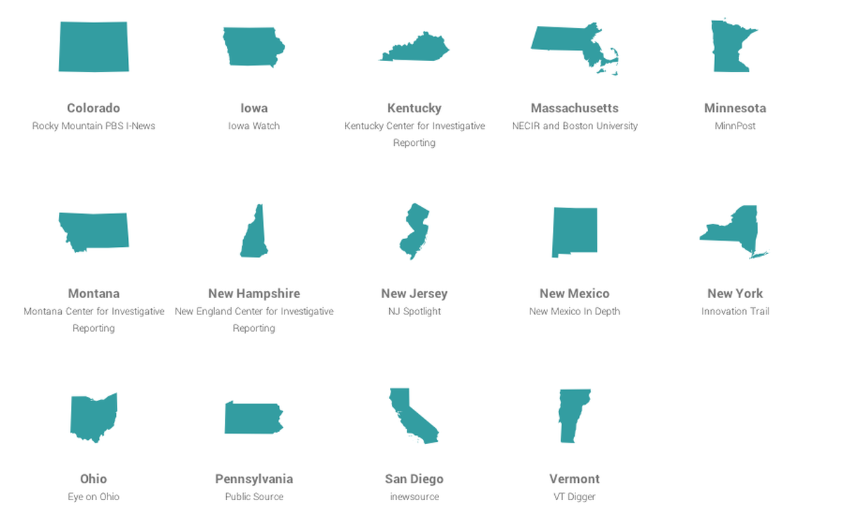
This is exactly the challenge we faced when we built our first news app to support an editorial collaboration among a group of INN member newsrooms. This collaboration, Power Players, combined state and federal campaign finance datasets to identify the top 10 donors from each state. (Well, among disclosed donations, anyway. We can’t know about dark money donors, but that’s another story.) Our collaborations at INN are open to any of our members, and in this case we had about a dozen interested in participating, all from different states.
The team recently wrote about the technological aspects of the project, which was built using the NPR app template, but we wanted to talk a bit more about the workflow and communication issues we encountered and what we learned along the way.
Project Beginnings
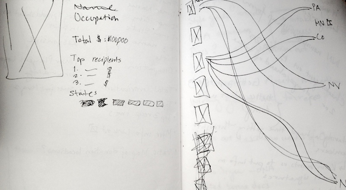
An early sketch
A project such as this takes a great deal of communication. Back in mid-September, I held a kick-off conference call with members to explain the project, story angles and the timeline. At the time our news apps and technology team was still under construction (in fact, our new Design Director, Kaeti Hinck jumped right into this project in her first week on the job), so we offered a preliminary idea we had for a news app, but we didn’t really have anything concrete to show. The plan was for me to analyze and deliver data for each state by October, and for the news app to be completed by Election Day, Nov. 4.
We hoped to build a “baseball card” style app with information about each individual—who they were, how they made their money, and to whom they give. The app would live in a central place but, importantly, would also include components that any member involved in the collaboration could use on their own website to enhance stories they publish about the data.
Wrangling the Data

Another sketch
After the initial meeting, the data needed to be analyzed and each state populated in a Google Spreadsheet so we could pull it into the app. Campaign finance data is notoriously dirty, especially when you’re trying to look at individual donors, as we were. We were also combining data from different sources, so the cleaning and analyzing stage took longer than expected. I kept a spreadsheet with all the members and notes about how each member wanted to handle exceptons and edge cases—data on couples, for example (should their donations be added or kept separate?). I also kept a file with all the cleaning queries I was running in SQL in case the data needed to be updated later and cleaned again.
Some member organizations also wanted more custom analysis, such as looking at local data only rather than statewide data as most members were. For the data analysis, this was easy enough to do. But it forced us to make some compromises in the design of the app, such as using the state outline for California but labeling it “San Diego.” One member wanted 12 to 15 Power Players, rather than the standard 10. Another wanted to look at data from only one election cycle instead of the two provided, so they didn’t use the app because its standard text explainers specified that data was from the two-cycle time frame. Some of these requests we were easily able to deal with but others we were not.
Bottom line for complex collaborations like this: Be ready for various editorial decisions that can alter your design or make it difficult for some members to adopt your work. Each editor and reporter is making decisions based on their local mission and needs, so it’s nearly impossible to make a one-size-fits-all solution.
Gathering Input

Mock-up of the state details page
While the app was still under construction, we also asked for input from the members. I created columns in the Google Spreadsheet for links to hosted photos of each Power Player and links to previous stories or business bios of each. Though we delivered the data used in their reporting in Excel, using the Google spreadsheet to populate the app made it much easier to collaborate with each partner on this aspect. Each member had access to the Google doc to double check all the information I’d populated, and to add photos. If there were any issues with photos not showing up (a common problem), any member of the tech team could investigate. Some members didn’t populate photos at all, and some weren’t able to find all 10 so we wish we could have given them more time for the data entry phase of the project.
Timing
Which leads us to the major obstacle for this project, as for so many others: the deadline. All of INN’s editorial collaborations are asynchronous, so members are free to publish stories according to their own timetables. In this case, the data was delivered before the app, so several members completed their reporting and ran their stories before the app was finished.
A couple of the partners used other tools, such as Tableau Public, to visualize the contribution data instead of waiting for the localized app components we said we would provide. We were thrilled they were able to get a good story and build an interactive themselves, but we’d have preferred to have our app ready for them in time to use—and to communicate more clearly what we were building and when it would be ready.
The app was ready by Election Day and subsequently adopted by several members. (You can check out one version here; the Kentucky Center for Investigative Reporting embedded our individual player cards with their story to nice effect.)
CMS Snarls
Fortunately, we were able to avoid many of the potential CMS problems because many of the members in this collaboration are among the roughly 30 INN members—one-third of our member newsrooms—who host their websites on Project Largo, a WordPress framework we built as a hosted platform for our member organizations.
Having a standard platform that we’re intimately familiar with makes it much easier to build components that can be easily reused and embedded on partner sites. The more of these issues we can eliminate by standardizing the systems our members use, the better they’re able to pool resources and the better we’re able to support them. Other members also use WordPress or other open source CMSs which we can also fairly easily work with and for this project, we only had one member unable to embed the app because its CMS wouldn’t accept inline JavaScript—not bad at all!
Our Takeaways
In future projects, we plan to have mockups of the app ready as early as possible so our members are able to visualize what we will be providing and how this will fit with their reporting. This should be easier now that our team is slightly larger and we can come in earlier on the front end of a project. We also want to provide a firmer deadline for launching an app so members can plan their publishing dates accordingly and leave time to implement the things we build. We’ll also aim to do a better job providing the partners with detailed documentation to make it as easy as possible for them to adopt our work.
This project showed that there is a great demand for news application work, especially among smaller nonprofit newsrooms without technologists on staff—which describes the vast majority of our members—and we learned some very valuable lessons in the process of building our first editorial app.
Credits
-
Denise Malan
Training director at @IRE_NICAR. Runner, author of @runbucketlist, Razorback, fan of baseball everywhere, but mostly KC.

