Features:
Finding Evidence of Climate Change in a Billion Rows of Data
How we made Engima’s Climate Change Map

Over the past month, conversation around climate change has started to heat up again. With the release of the American Association for the Advancement of Science’s What We Know and the Intergovernmental Panel on Climate Change’s Fifth Assessment Report, it seems as if there is a renewed sense that the “worst is yet to come.” But when compared to past bouts of public debate on climate change—whether around Copenhagen or An Inconvenient Truth—it’s clear that there is now a new factor to contend with: open data.
To be sure, data has always played a fundamental role in debates over global warming. The climate change controversy was sparked, in part, with the prominent publication of the controversial “hockey stick chart” in the IPCC’s Third Assessment Report and further kindled by Al Gore’s famous “off-the-chart” visualization of projected C0² levels.

The original “Hockey Stick Chart” from Mann, Bradley & Hughes 1999.
However, the difference between these earlier efforts and the present discourse is that now the data, tools, and technologies for analyzing climate change are increasingly accessible to journalists and civic hackers. This shift is evidenced in part by the White House’s recent launch of climate.data.gov which seeks to empower researchers, non-profits, media organizations, and companies with the data they need to communicate how global warming will affect people directly. As White House science adviser, John D. Podesta, put it recently, “if you’re thinking about this from the perspective of how your local community will be affected, it’s likely to change that question of salience.”
Bringing Data to the Table
Seeking to contribute to this conversation, the team at Enigma started to brainstorm ways we could produce a data-driven story on how climate change has played out in the United States. Browsing through NOAA’s National Climatic Data Center, we discovered the Global Historical Climatology Network which collects, aggregates, and standardizes daily weather information from more than 90,000 weather stations, dating as far back as 1800. While we come across many incredible public datasets in our work at Enigma, this one immediately stood out for its remarkable combination of geographic granularity and temporal breadth.
Starting with the raw files on NOAA’s FTP server, we downloaded each yearly file, which consisted of one line for each station ID, day, and measurement (i.e. maximum temperature, minimum temperature, precipitation level, etc.), and built up a dictionary where the keys were unique combinations of station ID and date and the values were arrays of corresponding measurements. We then joined this “wide” dataset, with the station manifest, which contained the name, latitude, longitude, and elevation of each station. Finally, we used Yahoo’s BOSS geocoding service to add each station’s country, state, and postal code, resulting in our final dataset of over 90 GB. All in all, this process took about four hours of processing time.
Detecting Outliers
Armed with this massive dataset, we set about formulating an analysis strategy. While some climatologists have argued that the last 10 - 20 years represent a “global warming hiatus” as the rate of increase in global mean surface temperature has slowed, others have shown that there has been no “pause” when it comes to extreme hot temperatures. Drawing inspiration from this debate and NOAA’s own Climate Extremes Index, we wanted to tell the story of increasing hot temperature anomalies over time, both for individual weather stations and the aggregate trend. To do so, we needed to devise a robust method for detecting outliers.
There is a rich literature on outlier detection and even the most “mathnostic” journalist should be familiar with methods of identifying statistical oddities with standard deviations. The trouble with these more traditional methods, however, is that they assume a normal distribution in which most observations are clustered around the mean and 95% of all observations fall within two standard deviations of the center. In our case, such an assumption was problematic as we were trying to identify outliers for specific locations and had no way of knowing ahead of time what the distribution of temperatures would be like across many thousands of stations.
A more robust strategy is to make no assumptions about the shape of the distribution and instead compute histograms of daily measurements for each station. With these histograms, you can then identify any time that an individual measurement falls in the upper or lower range of a location’s overall distribution, regardless of its shape. To do so, we first wrote a postgresql function to create histograms for any numeric column:
This function takes four parameters: the column you want to compute a histogram for, the minimum value of the column, the maximum value of the column, and the number of bins. You can increase the resolution of the histogram by increasing the number of bins, though this will also increase the amount of data you need to store and the time it will take to compute a data point’s percentile ranking:
This function then returns an array of integers, each representing the number of observations that fall in a given bin:
To identify where a daily measurement falls in its distribution, we wrote a function in python that takes this array and the parameters used to construct it, and returns the percentile rank of that value:
Running the Analysis
With our methodology and dataset in place, we were finally able to run our analysis. We loaded our 25 GB file into a postgresql table and created indexes on columns of interest (station_id, min_temp, max_temp). For each station, we computed histograms for daily minimum and maximum temperatures across the entirety of the dataset. To control for seasonality, we broke these histograms up into one for each month of the year. This way, we would be able to tell, for example, when a given day was unseasonably warm for the month of December. This process resulted in 32,592 (2,716 stations * 12 months) histograms which we cached in redis. To detect outliers, we cycled through each day for each station, looked up its corresponding monthly histogram, and calculated the percentile ranking of that day’s minimum and maximum temperatures using the function above. If one or both of these measurements fell in the bottom or top 2% of the distribution, we labeled it an “anomaly” according to the following typology:
- COLD anomalies occur on days when the daily high or low temperature falls below its expected range.
- WARM anomalies occur when the high or low temperature falls above its expected range.
- STRONG anomalies occur on those rare days when both the daily high and low temperatures fall above (STRONG WARM) or below (STRONG COLD) their expected range.

Our typology of weather anomalies.
This entire process took three hours of processing time and left us with a single CSV containing over three million records, or about 1,000 anomalous days per station.
From analysis to presentation
Once our analysis was complete, we set about deciding how best to present our results visually. From the outset, we wanted to communicate two key points:
- The proportion of “WARM” and “STRONG WARM” anomalies increased over our sample.
- The trend is difficult to detect when considering daily and even annual weather patterns.
One attempt took inspiration from the New York Times excellent “small multiples” visualization of drought incidence in the United States. In R, we plotted a map for each year, with each station colored by its percentage of “WARM” and “STRONG WARM” anomalies for that year. This approach had the advantage of communicating the geographic fingerprint of anomalies, like the effect of strong El Nino years (1992, 1996 and 1997) on the West Coast:

Station-level percentage of “WARM” and “STRONG WARM” anomalies per year.
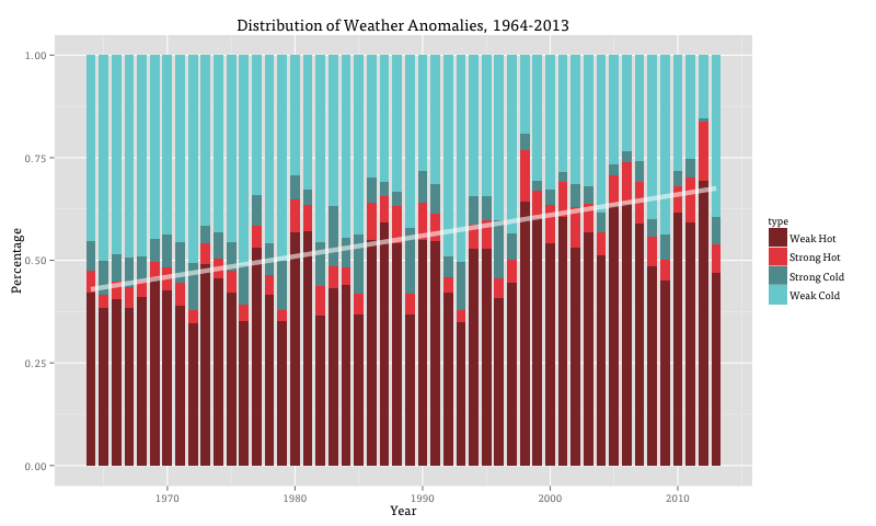
A simpler approach used ggplot to make a stacked bar plot of the yearly proportion of all four types of anomalies, with an added trend line of the proportion of “WARM” and “STRONG WARM” anomalies per year:

Yearly proportion of anomaly types with fitted trend line.
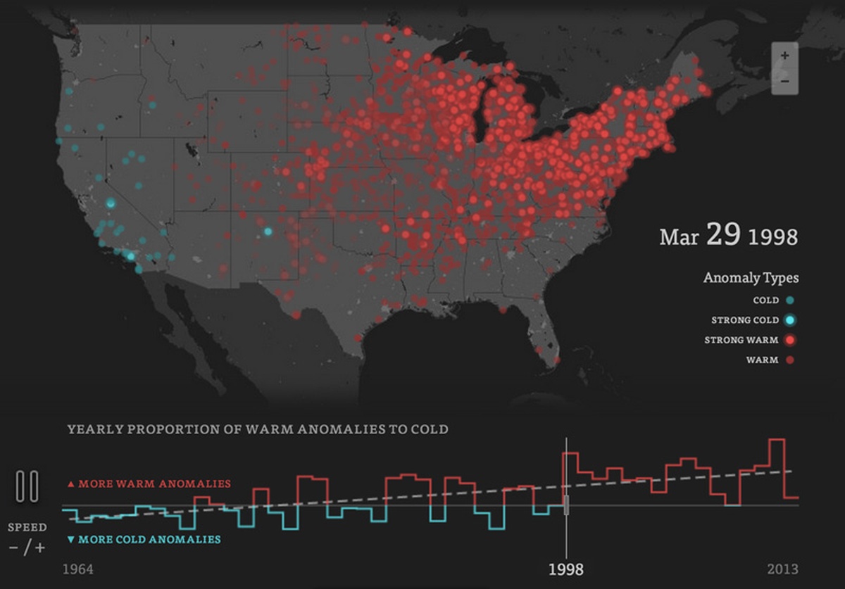
A final version simply animated each day’s anomalies colored by type:

Animation of one month of anomalies in 1986.
In the end we went with the final two approaches. While the bar plot clearly communicates the rise in warm anomalies over our sample, the animated map has the striking effect of showing heat or cold waves sweep across the country. Combined, they illustrate the tension between the sporadicity of daily weather events and the overall pattern of climate change.
While we don’t have space here to go into all of the wizardry Dan Delany pulled off in putting together the final site, it involved using Canvas and KineticJS to render upwards of 2,000 circles per frame with the data dynamically loaded from Amazon S3 in yearly batches.
Takeaways
As more and more data on our planet’s climate is made publicly available, it will be increasingly important for academics, journalists, businesses, and civic hackers alike to responsibly analyze and present this information in an interpretable fashion. While we are by no means climatologists, by combining a large public dataset, fairly simple statistical techniques, and compelling visualizations, we think our project told a digestible story of climate change without sacrificing too much rigor. There are certainly many qualifications: 50 years is a minuscule sample size for an analysis of climate and our findings should be taken hand-in-hand with the peer-reviewed studies that suggest similar trends (if you want to read more about potential problems with our methodology, there is a surprisingly useful comment thread on Hacker News). In the coming months and years, it is our hope that more individuals, news organizations, and non-profits will step up to help translate open climate data and scientific findings for public consumption. If you have an idea for a project or need help getting data, please contact us, we’d love to help!
Credits
-
Brian Abelson
‘he is clearly very clever’ - @nytimes legal dept. | data @kickstarter | https://t.co/o5FjZCIDql


