Learning:
The Evolution of NPR’s Picture Stories
Behind the scenes on the iterative growth and change of our stories and formats

Screenshots from Lost and Found, the story of amateur photographer Charles Cushman
In September of 2012, Claire O’Neill and I published a story about an amateur photographer named Charles Cushman. Cushman was a rare character for a couple of reasons. First, he was shooting in color at a time that most photographers were shooting in black and white, and though he was an amateur, he had an incredible instinct for making great pictures. His story and his photography were amazing, and we knew there was an opportunity to do something different with his story.
Traditionally, at NPR, a story like this would be published on our site with an audio player at the top of the page featuring a radio story, followed by text and a slideshow. As an experiment, we tried to think of how to take the audio, photography and text for this story and not treat them as separate content types, but instead integrate them into a storytelling approach that felt native to the web. For example, we wondered if we could combine audio, photography and text in the browser to achieve the immersive feel we wanted without sacrificing the ability to disaggregate the content and share or remix it in different ways. Also, knowing that users have an expectation of control over online experiences, could we introduce the right level of interactivity into the story without disrupting the momentum of a compelling narrative?
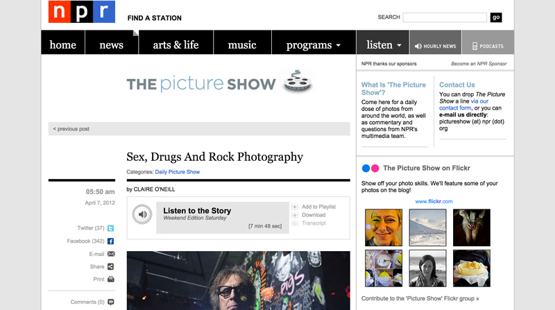
A standard story page on NPR.org at the time the Cushman story was published would have looked something like this.
The key to telling Cushman’s story well, we felt, was to use the audio narrative as the spine of the story and use Cushman’s photography to augment and enhance the telling of that story. While the audio and photography remain as separate elements that can be disaggregated, it is the integration of these elements in the browser that makes the story work. In addition, by providing a minimal interface for controlling the story we tried to strike a balance between a directed and interactive experience. If we did it right, then the technology powering the story would be invisible, and only after the fact would users think about how the story behaved and was presented.
Principles
Thinking about how to strike a balance between a directed and interactive experience, and how to enhance an audio-driven story with photography have become important principles for us as we explored new approaches to picture stories. Since publishing the Cushman story, we have continued to experiment and have developed some additional principles that help guide our thinking. Here are some of the key principles.
Not Just On the Web but Of the Web
One way I often describe the stories we tell is that they are of the web and not just on the web. Consider YouTube, Netflix or Spotify. They are successful services that use the web to deliver media to users in well designed and intuitive interfaces. The media that they deliver are on the web. You can watch a video online or listen to a piece of music online, but the stories these services contain are isolated inside a file type. The stories we are telling are telling rely upon integrating multiple file types and formats that work in concert to deliver a story as a web-native experience. Without a browser our stories would not work.

Life After Death combined photography, text, ambient audio and narrative audio to tell the story of the aftermath of Ebola in Barkedu, Liberia.
For example, in Life After Death, our story about the aftermath of Ebola in Barkedu, Liberia, we combined photography, text, ambient audio and audio quotes into a single slide. These elements are integrated in the browser with HTML, CSS, and JavaScript. This allows us to tell this story in a way that would not be possible with video or audio alone.
The goal of including audio quotes in this story is to minimize the distance between the user and people of Liberia whose story we are telling. We wanted users to hear the emotion in voices of the villagers of Barkedu. If this were a story told purely in audio, we would have needed to hear the voice of an interpreter in lieu of the subject. By integrating the audio quotes into a text narrative, we not only give control to the user over the pacing of the story, but we provide users with the ability to hear this emotional story in the voice of the subject.
User-Centered Design
In all the work that we do, we strive to think empathetically about users who are trying to discover, understand and respond to the stories we tell. This starts at the very beginning of a project when we work as a team to assess user needs and declare assumptions about what we think users know and desire to know about the story we want to tell.
After the team has a shared understanding of user needs and editorial goals for a story, we work through an iterative process of refinement to validate or refute assumptions about our approach to the story. Assumptions are challenged through both qualitative methods like usability tests and quantitative analysis of our web analytics. While our assumptions are often wrong, I believe that an attitude of putting users first is the most important principle we follow. It is only through a continual process of research, testing and analysis that we can hope to better serve our users needs and craft meaningful experiences.
Let Content Drive the Form of the Experience
We use a common codebase for each of our projects called the app template. As a template, it is agnostic about the form or presentation of a story. I prefer to think of it as a set of building blocks that make getting a project started more efficient. Because we are not locked into a format for telling our stories, we can let the needs of the content drive the shape of the story. A benefit or maybe consequence of this approach is that we don’t really have a generic photo story template that we can quickly plug content into. Each story we create requires a level of art direction that takes into consideration the format and design of content on a story-by-story basis.
For example, in Demolished, we tried to tell a multifaceted story about public housing in Chicago which included a story about failed public housing policy, a story about Patricia Evans, a photographer documenting the lives of Chicago public housing residents, and a story of the residents themselves. To help us think about the design of the story at these different levels, we came up with the metaphor of buildings and windows. We wanted to evoke the feeling of the scale of the problem and the size of these projects through tall rectangular shapes and emphasize personal stories through squares which served as windows into the lives of the residents.

The flexible format of sequential visual stories provided us with the opportunity to explore a custom design that supported the needs of Demolished, a multifaceted story about public housing in Chicago.
In addition, we wanted to use illustration on top of photography to accentuate points being made in the text. If we were working with a rigid template that had baked in assumptions about the design and presentation of a story, achieving the result that we did in Demolished would be difficult.
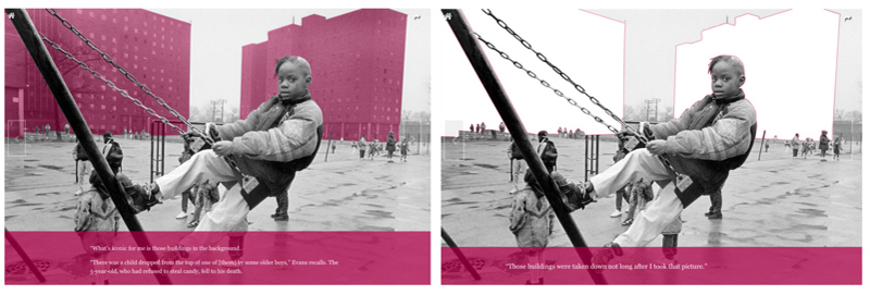
Illustration is combined with photography and text to emphasize key points in Demolished.
Identify a Dominant Media Type and Enhance its Delivery with Subordinate Media
Stories that combine multiple forms of media can come across as distracting (two forms of media with conflicting goals that are competing for attention) or disjointed (media sidebars that feel detached from the primary experience). By choosing a dominant media type and integrating it with subordinate media, it is possible to combat these ills and achieve an immersive experience that is greater than the sum of its parts.

A Brother and Sister In Love is an audio-driven narrative that is enhanced by textural imagery and photography.
For example, in A Brother And Sister In Love, you hear comedian John Fugelsang tell the surprising story of his parent’s lifelong love. On its own, the audio story is a compelling narrative, but when paired with textural imagery, Fugelsang’s family photos and some text at key moments enhance the whole experience.
The web is a visual medium and by providing a visual accompaniment to an audio narrative we give the screen a meaningful purpose, while simultaneously transporting the user through a story told in sound. If done correctly, the two media work together seamlessly and users don’t think about the various media as separate elements. As a storyteller in the conceptualization phase of a project, I find that the opposite is true. Working on a web-based picture story, we are typically working with multiple content types and innumerable ways that we can combine them to tell a story. Identifying a dominant content type in which the heart of the story will reside becomes a helpful constraint that gives structure to the story you are trying to tell, and clarifies the relationship between multiple elements.
Strike a Balance Between a Directed and Interactive Experience
In our work, we strive to strike a balance between the power of an editorially directed experience, and the personalization interactivity affords. A good narrative has a rhythm and inertia to it that pulls users along. It’s a great feeling to get lost in a story, but there are so many distractions that can get in the way. This is especially true with interactive storytelling. The web is an interactive medium and users have an expectation of control, but providing too much customization and control leads to frustration and abandonment. Finding the right amount of control gives users the ability to experience a story in a way that resonates with them while simultaneously providing a path that supports the narrative.

The Planet Money Makes A T-Shirt interface suggests an optimal path for navigating through the story as well as primary and contextual navigation to give users control over how they choose to experience the story.
For example, in Planet Money Makes A T-Shirt, the video at the beginning of each chapter in the story contains the emotional heart of the story. We knew we wanted direct users to experience that first. By leading with an edge-to-edge, focused video experience and limiting the number of choices available, we placed an emphasis on watching the video first. Five seconds before the end of a video, as the audio begins to fade out, we trigger an event that automatically scrolls the user down the page into the text portion of the experience. This opinionated action sends a signal to users to consider the relationship of the text to each video.
Upon reaching the text, we provide contextual navigation to the next chapter to allow users to regain control of the experience and choose whether to continue their journey to the next chapter or dig into the current chapter in greater depth. Our ultimate interface goal was to remove any friction from the experience that would inhibit users from enjoying the content they were most interested in.
If It Doesn’t Work on Mobile, It Doesn’t Work
To build an experience for a specific platform or context is a non-starter for us. It’s important to us that our picture stories be available on as many platforms and devices as possible. To ensure that’s the case, every project we build takes into consideration the features, presentation and performance of our stories on devices as small as smartphones with limited bandwidth to jumbo sized desktop displays with a fast connection.
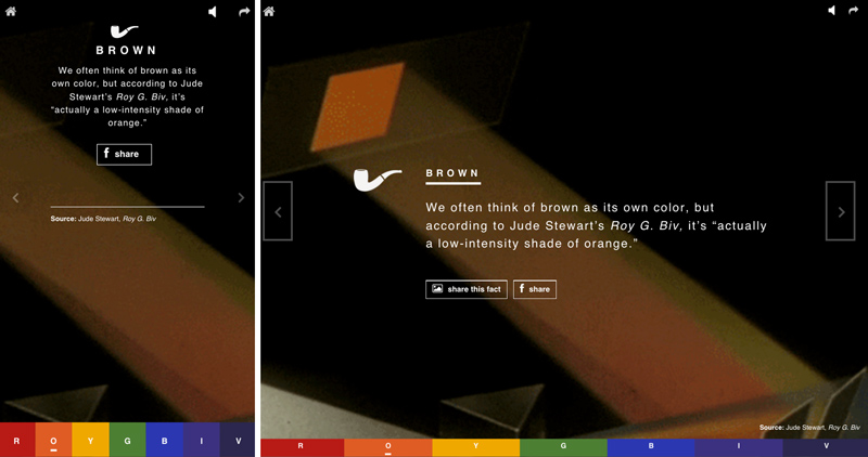
This Is Color is a responsively designed sequential visual story that presents users with a fun and surprising collection of facts about colors. On the left is the smartphone view of a fact about the color brown and on the right you see the same fact in a desktop view.
On the one hand, building an experience that must respond to a wide variety of contexts is a constraint. There are things we can’t do with some of our stories because the features we desire would not be supported across devices. On the other hand, this is a major benefit because we have the ability to connect with users in whatever context they may find themselves in.
The NPR Picture Story Ecosystem
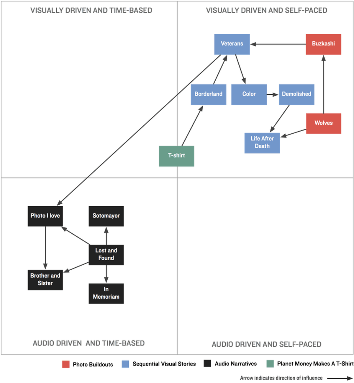
As we have explored different approaches to picture stories, the principles we follow have given our work a sense of cohesion. And in looking at a sample of stories that we have published since September, 2012 some clear patterns have emerged, which I’m calling Photo Buildouts, Sequential Visual Stories and Audio Narratives. The one outlier that does not fit into a single category is Planet Money Makes A T-Shirt. The scale and approach to the project can’t be compared to anything we’d published before or since. Despite its uniqueness, it remains an important part of our picture story ecosystem, because of its influence on many of interface and design patterns we’ve used since its creation. Here’s a brief description of each approach.
Photo Buildouts

Wolves at the Door was our first experiment in thinking about how invert the relationship between photography and text.
Inspired by work on Medium, Exposure and the role of art direction in story page design, photo buildouts are stories that invert the usual relationship between text and image in a scroll-based layout. In lieu of treating photography as a subordinate element of the page, as you would expect in text-focused layout, our goal with photo buildouts is to make photography the focal point of the layout without sacrificing the intuitive and fluid experience of scrolling through a web page.
Photo Buildouts from the Picture Story Ecosystem
- Wolves At The Door (2/3/14)
- Buzkashi (5/4/14)
Sequential Visual Stories

Borderland combines photography, text, video and data in a sequential way to tell the story of life on the U.S./Mexico border.
Inspired by the thinking behind Robin Sloan’s tap essay Fish, Scott McCloud’s writing on comics and sequential art, and Frank Chimero’s exploration of What Screens Want, sequential visual stories are self-paced experiences controlled through a minimal interface. Like a slideshow, ideas in sequential visual stories are presented in a linear and visual way—but unlike a slideshow, which treats the image as the dominant element, sequential visual stories mix multiple forms of media. A key advantage of this format is that it can direct a user’s focus in a way that will have editorial impact, without taking control away from users over the speed in which they experience the story. Through revealing moments over a sequence of screens, we can emphasize key ideas, offer surprise and juxtaposition. And because users have control over the amount of time the spend on each screen, they can linger on images and ideas that are most important to them.
Sequential visual stories from the picture story ecosystem
- Borderland (4/3/14)
- What Do Homeless Vets Look Like? (9/18/14)
- This Is Color (10/23/14)
- Demolished (12/23/14)
- Life After Death (2/20/15)
Audio Narratives

How long can you stare at a single photograph? Our first experiment in a series we’re calling A Photo I Love. Erin Mystkowski describes a photo she loves as an audio narrative while the photo is presented on screen edge to edge. Listening to Erin’s story provides users with the opportunity to study the image while simultaneously adding meaning to what is being viewed. In this way, the sound and visual are complementary and are greater than the sum of their parts.
Inspired by the thinking behind Popcorn.JS Brett Gaylor’s thoughts on web-native storytelling, and the early work of Kara Oehler and Zeega, audio narratives are time-based stories told in sound and augmented and enhanced by text and visuals.
Audio narratives from the picture story ecosystem
- A Brother And Sister In Love (2/13/15)
- A Photo I Love (11/18/14)
- From The Bronx To The Bench: The Family Photos of Justice Sotomayor (1/14/13)
- In Memoriam: Musicians We Lost In 2012(12/31/12)
- Lost and Found (9/14/12)
Planet Money Makes a T-Shirt

Screenshots from the web documentary, Planet Money Makes a T-Shirt. You can read more about the making of this story in this related Source post.
Unlike other web experiences we’ve created in which one dominant media type drives the narrative, Planet Money Makes a T-shirt is a dual experience that combines time-based and self-paced content. In the interface, users are presented with the process story of how a t-shirt is made in a layout optimized for viewing video, and the economics behind the making of a shirt in a layout optimized for text. To make these distinct modes of experiencing content feel integrated, we embedded cues that would help maintain the narrative flow without taking control away from users.
Consistency & Improvement
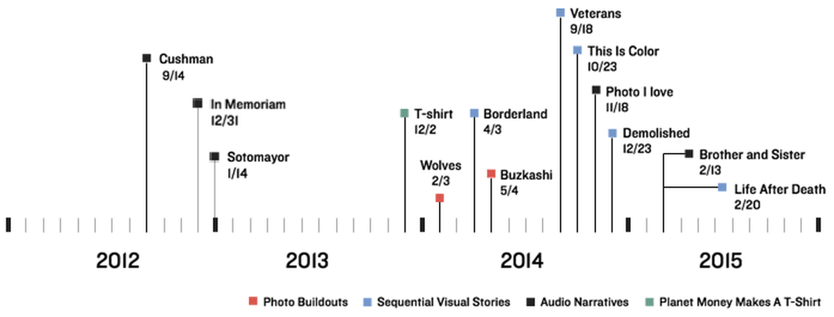
A timeline of NPR picture stories
In looking at the ecosystem of NPR picture stories as a timeline, it becomes apparent that the evolution of our picture stories has not happened in a linear fashion. We explore different approaches intermittently, but they all evolve and grow together. In assessing the needs of a new story, all the knowledge we’ve accumulated from different experiments gets folded into our thinking, and best practices that work across formats begin to emerge. Here are a few examples of how experiments working with different formats inform each other.
The triumph of the humble begin button
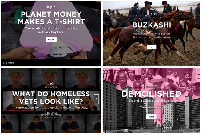
In Planet Money Makes a T-shirt, we introduced the idea of pairing a full-bleed title card image with a button labeled ‘begin’ to enter a chapter that starts with a video. Since that time, we have tried several variations on the begin button approach.
What’s the best way to introduce an experience to users? The title cards we use in our stories need to set a tone and communicate the depth and format of an experience, without distracting from the central goal of getting users into the story. While the evolution of our title cards is ongoing, one pattern that has proven to be durable regardless of the format of content the title card introduces is the use of the begin button.
On our title cards, we have tried different labels to signal different kinds of media, and different button placements to signal the mode of experience. For example, with sequential visual stories like the one we published about homeless veterans, we wondered if it would be more intuitive to place the button on the right side of the page with a right caret to indicate linear movement through an experience that was not scroll-based. And for scroll-based stories like this one about Afghanistan’s national sport, Buzkashi, we wondered if a carat pointing down would help set expectations of a scroll. We also used the begin button with all of these picture story approaches for comparison.
Through this experimentation we learned that the begin button is as effective and in some cases more effective than other approaches. In a sequential visual story about the end of Chicago’s public housing, we had initially tried to use a right carat on the right side of the page. In doing so, we observed that users were having a hard time finding the entry point to the experience. As a variation, we tried animating the right carat to draw attention to it and finally tried to use the begin button. In the end, the begin button proved to be the most effective way to enter this story. Going forward, we plan to continue to use the ‘begin’ button on our picture story title cards, until we find a better solution.
Ambient Audio

To add texture and depth to our photo stories we have attempted to incorporate ambient audio into both photo buildouts (left) and sequential visual stories (right).
If done correctly, the use of ambient audio can add depth and immediacy to a visual experience. If executed poorly, it introduces dissonance and serves as a distraction. Our first exploration of ambient audio in a picture story was in a scroll-based story about wolves. In the story, we attached triggers to points on a page, so that as a user scrolled down the page different ambient sounds would be activated to add texture to the experience. Our goal was to associate the ambient audio with a specific picture and keep the audio in the background for several images and paragraphs, until a new section was scrolled to and a new ambient audio track was introduced. The problem with this approach is that depending on the user’s screen size, scrolling speed and what they are paying attention to at a given moment, the discovery of the ambient sound is not always associated with the trigger point. Consequently, users are left trying to reconcile the sound of ambience with whatever they happen to be looking at at the time they notice it. If the sound and image are not complementary, users become confused and distracted from the story.
Working for NPR, a company obsessed with sound, I know the power of ambient audio, so we tried again with a different story in a different format. In Life After Death, a sequential visual story about the aftermath of Ebola, we attached the activation of ambient audio to a click/tap event instead of a scroll event. In doing so, we were able to more precisely control the presence of the ambient audio and strengthen the relationship between the picture and sound. We could play an ambient sound over several slides or layer the ambient sound with additional sounds to add depth to the story. In doing so, we achieved a more powerful result that made the photography feel more direct and immediate.
Multivariate Testing


A random selection of users who visited A Brother and Sister in Love saw a “care question” before being presented with a button to support public radio (above) while others were only presented with a support button (bottom)
To test different ways to get users to take action at the end of a story (sharing, following, supporting etc..), we have recently started to conduct multivariate testing on the conclusion slide of our sequential visual stories. My colleagues Tyler Fisher and Livia Labate have written an excellent post explaining the process in detail, but in brief, the process entails showing a random selection of users slightly different versions of the same screen to assess which version of the screen users respond to most positively.
For example, we had a hypothesis that by showing users a question like “did you like this story?” before showing a button to ‘support public radio’ that users would be more likely to click on the ‘support public radio’ button. When the results of the test were calculated, we were able to determine with 99.90% confidence that prompting a user with a question before asking them to ‘Support Public Radio’ was more successful. Because of the precision of the tests that were conducted on our sequential visual stories, these learnings can be applied to other stories.
Room for (More) Improvement
It’s my hope that by the time this article is published our picture story ecosystem will have already evolved. If I could target two areas for improvement I would focus on dynamic content and user participation. Unlike a film or a piece of audio that are both artifacts, the picture stories we publish online have the unique ability to grow and evolve over time. In our picture stories, we have only scratched the surface of what’s possible like the Instagram call-out at the end of Planet Money Makes A T-Shirt. Other NPR Visuals projects that live outside the picture story ecosystem like Playgrounds For Everyone have done more to make dynamism a meaningful part of the story. It would be good to bring more of this thinking to the picture stories we tell.
Organizations
Credits
-
Wes Lindamood
Senior interaction designer @nprviz. Music and documentary film obsessed dad.

