Learning:
Design Principles for News Apps & Graphics
Lena Groeger’s lowdown on how to apply classic design principles to your newfangled interactive graphics and apps

[Cross-posted to the ProPublica Nerd Blog.]
While the tools and techniques to present large datasets in graphics and news apps may differ from project to project, the basic design principles stay pretty much the same. Many of these principles should seem pretty familiar—even if you’ve never studied design formally, you probably know some of them instinctively. Let’s name them, explain why they work and see how other designers, especially news designers, use them. Once you recognize the concepts, you’ll become more conscious of when and how to use them in your own projects.
Invisibility: Good Design Disappears
Invisibility isn’t a design principle per se, but for me it’s a helpful way to think about what these basic design principles are actually for.
Invisibility means design that’s clear, design that goes unnoticed (except perhaps by other designers) and design that “just works.” When a design presents distractions, discrepancies, conflicts and mismatches between what we expect and what we see, our brains have to put in more effort to figure out what’s going on. Good design eliminates as much of this extra effort as possible. Through placement and grouping and hierarchy, good design frees up mental space so users can think about content, and not where they’re supposed to be looking and how to interpret what they’re seeing.
Invisible design is strong design—if people don’t notice it, it’s not getting in the way.
Scale: Show the Near and the Far
Years ago a design instructor explained to me that whenever he designed a poster, he kept two viewpoints in mind. First, the viewpoint of the person seeing the poster from across the street, who could only make out the large forms and main ideas. Second, the viewpoint of the person who had crossed the street and was now looking at the poster close up, who could see all the details and wanted to find specific information. As a student, I thought about this a lot in the context of making posters, but didn’t realize how much value it had in the news world.
So I was surprised when, a few months after I began working at ProPublica, we talked about some of the design theories behind our work. Our news apps have (at least) two views. First, a “far” view, which is the national picture, how places compare, why you should care about this story as a whole; and a “near” view, which is, ideally, readers’ own personal stories—their town, their hospital, their school, etc.—all of the details that matter to them personally.

The far view (left) and the near view (right). ProPublica, The Opportunity Gap.
The “near and the far” serves not only as a metaphor for organizing a news app, but also as a guide for organizing a single page. Users will subconsciously evaluate each element’s importance based on its position and size relative to all the other elements on the page, so the 72pt text at the top will seem more important than the 9pt fine print in the lower-left-hand corner. These attributes establish a visual hierarchy, and let users know where to focus their attention first. It’s the designer’s job to make sure the hierarchy of elements matches the editorial goals. A good start is to make the most important editorial element (that is, “the nut” of the story) the most noticeable thing on the page.
The editorial and design considerations that go into poster design apply in much the same way to making a news app. Both require an understanding of the principle of scale. Whether it’s across the street vs. close-up or the national picture vs. the personal, scale works by grabbing people’s attention and interest, giving them context, and then drawing them in closer and showing them the details.
Alignment: Don’t Be Haphazard
In graphic design you often hear about alignment in terms designing on a grid, or making text flush left or right. These are examples of a higher principle: Everything should be positioned for a reason, and should align with related elements. Strong lines can help organize elements, so proper alignment gives a sense of structure and unity. When in doubt, find a line and stick with it.
Alignment is the driving force behind the table, one of the most common ways to present data. So prevalent we probably pass them over most of the time, tables are great examples of how alignment can aid the presentation of a lot of data. NPR’s Big Board was just such a design that managed, through alignment, to present a lot of information very clearly and intuitively about the 2012 election (their main election page also made great use of tables).

Tables: pretty good at alignment. NPR, Elections Big Board.
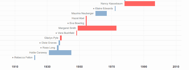
Alignment can also be used to represent more abstract concepts. This New York Times graphic on women in the Senate uses alignment to organize time. In this case, a line’s placement on the horizontal axis indicates where it lies in time.

Alignment to indicate place in time. New York Times, Women in the Senate.
When elements are arranged along a strong line, users don’t need to be able to see the line to know that it’s there. In many cases you can safely eliminate table borders. Strong lines speak for themselves—even when they’re invisible.
Careful alignment also make it easy for the user to detect outliers, because anything that deviates from the norm will immediately stand out. The humble bar chart is a great example of this phenomenon. By aligning all bars along the bottom, our brain can rapidly detect length differences at the top.
A centered alignment has a weaker line, so a good rule of thumb is to avoid centering things. If you’re going to center it, do it consciously, not by default.
Repetition: Emphasize Common Forms or Functions
Repeating visual elements like shapes, typefaces and colors establishes a sense of purposefulness and internal consistency. You can use these elements to unify a design across multiple pages or products, so that users know they belong together. For example, the science magazine Nautilus uses a particular color yellow across its website (in bits of highlighted text or section backgrounds), to establish a cohesive look and feel and remind you that all pages are part of the same publication. You can also use repetition to associate elements in a users mind with a particular function, such as the ability to input text or sort a table. For example, a blinking cursor is repeated all over the web to mean “if you type the text will appear here.”
Repetition also helps the user instantly see what is similar, and reveals what is different. By seeing the same form repeated, the user can easily recognize slight variations. This is the idea behind small multiples, which are sequences of small graphics that display differences in data and can be easily compared. Small multiples have the added benefit of not relying on the viewer’s memory to see the comparisons, because every element is presented to you at the same time. In this New York Times graphic, you can actually see changes in drought patterns because your eye becomes accustomed to the small US maps and perceives only the changes between them.

Small-multiple mini maps make comparisons easy. New York Times, Drought’s Footprint.
In the same way, repetition can be useful to establish a visual cue for the function of an element across projects. At ProPublica we have an internal set of standard design elements, such as a particular color blue that we use for all the search boxes or input fields, which we call “do something blue.” We repeat this color throughout our site so that people who’ve used our apps more than once begin to associate the color with the ability to search, filter or participate.

“Do Something Blue” in the wild. ProPublica, Dialysis Tracker, The Opportunity Gap, Dollars for Docs.
In many cases you don’t have to create these visual cues from scratch. The web is filled with design conventions that you should follow as much as possible so that your design is intuitive.
Contrast: Don’t Be a Wimp*
Use design choices like color, size, and typography boldly to get people to notice what you want them to. The eye is drawn to movement on a still page, bright colors on a page of muted colors and bold elements on a page of neutral ones. Contrast attracts the eye, provokes emotion and directs attention. So don’t be shy about it—too much subtlety will make your users think the element is broken or its design a mistake. If a user has work to figure out whether a switch from 12-point type to 13-point type was actually on purpose (“is it really different? why is it different? what does it mean?!”), then she is working too hard and has missed your point. Make it obvious.
For this graphic on drones, we wanted to point out contradictions between statements from officials on the CIA drone program. Among the long list of statements, we used a contrasting color to indicate the outliers, highlighting the contradictory statements in red. Strong color differences are processed very rapidly by the brain’s visual system. They immediately pop out from the background, which in this case was the effect we intended.

Contrast to highlight contradictions. ProPublica, Stacking Up the Administration’s Drone Claims.
Contrast can reveal the variability that exists in the data, add visual interest and make a point. It can also tell a story. This NY Times interactive on the aftermath of a deadly tornado lets you look simultaneously at a street in Moore, Okla. before and after the storm. Here the contrast comes from the photos themselves. Our brains are attuned to notice the differences, so highlighting them is a matter of capturing and closely coupling the panoramas.

Contrast to compare then and now. New York Times, Before and After: 360° Views From Moore, Okla.
If interesting differences are the “story” behind your graphic, then make them clear and very obvious. Design consistency shouldn’t get in the way here. In our drones example, if the contradictory statements were just bolded or slightly bigger, they may not have had the same effect.
*Shamelessly stolen from The Non Designers Design Book
Proximity: Keep Things Together That Belong Together
Proximity is like organizing a drawer. Things that are similar, like socks, get put together. Shirts go someplace else. If related things are grouped together, they are easier to find, and no one is forced to hunt around for information (or socks).
Putting things together visually that belong together conceptually not only reduces clutter, but helps establish a visual hierarchy as you group and subgroup different elements into discrete visual units. Fight the inclination to evenly spread out all your content and fill every pixel of the screen. Well-organized empty space can direct people’s attention in the same way a headline can. Don’t fear white space.
The Huffington Post’s House outlook page uses proximity to group related elements (the half circle representation of seats and five important numbers).

Effective grouping and white space make for a clear presentation. Huffington Post, 2012 House Outlook..
Proximity means keeping text close to the data it is describing, legends close to the map they’re explaining, etc. The “annotation layer”, a phrase coined by by Amanda Cox for guiding a user’s attention and providing clues to what’s important, also works because relevant text is positioned next to the elements being described. (Here’s a wonderful example of an annotation layer adding context and explanation.)
In this reconstruction of the Boston Marathon bombing, descriptions and labels are placed as close as possible to the relevant parts of the image (sometimes directly overlaid) instead of, say, listed all at the bottom. WNYC’s project on Fielder Avenue also keeps a navigational mini-map, photographs, and quotes together to emphasize their connection.

Keep your annotations close. New York Times, Reconstructing the Scene of the Boston Marathon Bombing.

Photos, quotes and a map are grouped to create visual units. WNYC, Fielder Avenue.
Intuitiveness: Features Should Suggest Function
In the physical world, some objects are better suited for some things than for others. A door handle is better for pulling than a flat piece of metal. A wheel is better at rolling than a square box. The properties that make an object good at its function are called affordances (as in, a wheel affords rolling.) When an object is designed well, its affordances match its intended function. We know to pull the door open without any instruction, because its handle affords pulling.
In the virtual realm, we don’t have too much control over affordances. You can click every inch of your screen (the screen affords clicking) even if nothing happens in response. What we do have control over are “perceived affordances,” or what the user perceives the intended function to be.
It turns out that we bring plenty of intuitions and learned conventions about what affordances should look and work like, and about how to read and navigate visual information. Some of these are simply cultural conventions, for example that red means “stop” and green means “go”, or that scroll bars are located on the right side of the screen. But they’re very real. Put the scroll bar on the left and things will seem broken.
Other conventions are more deeply rooted in how our brains work. For example, take line and bars charts. We tend to read lines as showing trends—they are continuous, they connect, they show things that have a common dimension. On the other hand we read bars as showing discrete comparisons—they are categorical, they separate, they present things that are distinct. Those intuitions are so strong that they influence the way we interpret data, even if it leads to rather curious interpretations.
A couple years ago researchers had students look at either line or bar charts representing the same data: the height of men and women. One student who saw the line chart version explained, “as you get more male, you get taller.” No kidding. Our intuition that lines show trends is so strong that it biases interpretations in unexpected (and absurd) ways. Don’t fight these intuitions. Work with them.
In The Design of Everyday Things, Donald Normal writes: When a device as simple as a door has to come with an instruction manual—even a one-word manual—then it is a failure.
A well designed news application or graphic needs no instruction manual for the majority of its users. Understand your users intuitive sense of things and don’t violate them by mistake. Pick chart types that make sense for the data you’ve got. Avoid using a line chart to display categorical data or bar charts to show trends or continuous data. In a similar vein, keep consistent with web standards like blue links and right-hand scroll bars and buttons that look like buttons and a mouse pointer that turns into a hand when hovering over something clickable. On tablets, follow the conventions of that platform. They’re there to help you.
When you break these intuitions and conventions, do it purposefully (be obvious!) and know you might have to give people clues on how to use your design.

Stop it.
Simplicity: Take Out What’s Extra
If something isn’t necessary, take it out. Be ruthless in the cause of clarity and in defense of your user’s attention. Lose extraneous visual elements like gratuitous decorations, and make editorial decisions to eliminate anything that isn’t crucial to what you are trying to present. Chop off excess explanation and over-long copy, and eliminate user-pathways that don’t tell a story to your users. Not every column of the data you’ve analyzed needs to be in your app or graphic, and not every finding of your reporting needs to be in your story. Design is just as much about what you leave out as what you put in.
This doesn’t mean that you should ignore delight and surprise—the most minimalist, highest data-ink ratio is not always the right option. Projects are made with different goals for different audiences. But all elements should be there for reason.
Now It’s Your Turn
I hope that these basic design principles will come in handy the next time you want to present lots of information visually. Try to apply each principle in turn, making adjustments to sizing or contrast, grouping elements together, taking out what’s unnecessary and making sure intended functions are intuitive. If something isn’t working, put the problem into words, and try to identify a principle that might fix it. Soon you’ll recognize these principles everywhere, your designs will be more deliberate, and you’ll be more in control. Good luck!
Inspiration, Resources and Things You Should Really Read Now
- The Non-Designers Design Book, Robin Williams (designer, not actor). A fantastic intro to graphic design.
- The Design of Everyday Things, Donald Norman. You will never look at doors or teapots the same way.
- The Tufte Classics, Edward Tufte. If you’ve got these sitting on your bookshelf looking intimidating, open them up! They’re mostly annotated pictures and full of great examples.
- The Functional Art, Alberto Cairo. A good introduction to information graphics, from a journalist’s perspective.
- Universal Principles of Design, William Lidwell. An almanac of design principles, from graphic to interaction to architecture.
- Visualizing Thought (paper), Barbara Tversky. A detailed look at how we interpret visual expressions like symbols and marks.
For something a bit more technical, we’ve put together a news apps style guide of best practices.
Credits
-
 Lena Groeger
Lena Groeger is an investigative journalist and developer at ProPublica, where she makes interactive graphics and other data-driven projects. She also teaches design and data visualization at The New School and CUNY. Before joining ProPublica in 2011, Groeger covered health and science at Scientific American and Wired magazine. She is particularly excited about the intersection of cognitive science and design, as well as creating graphics and news apps in the public interest.


