Learning:
Creating The Grid: a Story of Prototyping
Joey Marburger on the prototype process behind creating the Washington Post’s interactive, The Grid.
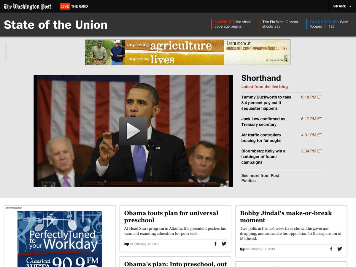
The Grid—State of the Union, February 2013 (The Washington Post)
It was the start of the Election season in 2012, and like most media companies we were planning our coverage, projects and new ideas. Many projects were proposed in the digital design department as well as the graphics department, but one gained momentum after a few months of building other projects. This project was The Grid. While we were building other projects that did very specific tasks or covered one specific area, we didn’t have a bird’s eye view of events. We wanted to create something that gave users a view of everything—especially around live events. The Grid was built for live events, to bring the entire social conversation around an event or breaking news into one destination. The Grid also has lead modules that anchor the top of the page to show video, comments, live blog updates, and more. This is separated from the main card area to show that it is important information and is what’s happening now. The Grid from this year’s State of the Union can be found here.
Oh, and we wanted The Grid to be a responsive design to run on every platform we could manage. That means that The Grid needed to adapt to the user’s device such as desktop, tablet, or smartphone, and display the content in the best way possible for that device. With such an abundance of content, we opted for a grid-based design—also referred to as a waterfall design—showing a series of card-like modules with content. On desktop, a user may have several columns and rows of these cards. On tablet, The Grid becomes optimized for touch and reduces the number of cards present by breaking the layout into fewer columns. On smartphone or small-screen tablet, the columns condense to a single column along with a streamlined navigation at the top. There are further enhancements for interacting with The Grid as well such as a “load more” button rather than automatically loading new content and a “back to top” button so the user does not have to keep scrolling after a large amount of content has loaded. The grid design also allows for reuse of the card designs with varied content. This was all achieved through a combination of CSS screen size detection as well as JavaScript parameters to identify which device the user is on.
In our development process, we set the Democratic and Republican political conventions as our deadline to take The Grid for its first public test drive. That gave us about two months to do it. We knew we need to do a lot of the work in tandem between back-end and front-end work. We started designing, prototyping, and developing the back-end framework simultaneously. This allowed us to immediately react to what each person was building. Designs could be prototyped and tested with real content from the back end so we could identify any missing data or design challenges. Also, we could determine how readers would react to it since we passed the prototype around internally to have our editors and producers test it.
Amanda Zamora, now at ProPublica, was the initial starter for the project and teamed with Sarah Sampsel and me to start the initial concept walk-through and brainstorming. Once we had a solid idea of what we wanted to build, we worked with multiple developers to start building each individual piece. The lifecycle from start to finish involved multiple tracks happening at the same time while we met daily for quick meetings to give each other updates on progress.
After the initial planning and developer assignments, we needed the design. Sampsel, our director of digital design, started the mockups while I started building a prototype in tandem. We shared ideas and would implement changes quickly so we could see what would and wouldn’t work. In the meantime, our newsroom-embedded developers were working on the backend that would power The Grid by incorporating various social network feeds and also process our own articles, photos and videos. By building the back end and front end independently, we were able to collaborate on what each other needed so we had less delay at the end. This was one of the cool things about working on it—seeing it grow every day. Also, testing things instantly to see what worked and didn’t gave us immediate feedback. Eventually, the prototype would become the actual build of the project.
The most exciting part about finishing The Grid was the excitement and feedback we received from the public. Also, it was our first major project with responsive design so we proved that we could do it and what the benefits could be. We now use The Grid on a regular basis for various events.
Big Challenges
With a complex project inside a big organization, who does what when is always an issue. From the initial concept we had developer resources lined up but lacked front-end development, which is where I came in starting with a prototype. We didn’t realize what level of development resources we would actually need at first, and quickly found we were behind. This reactive focus also distracted us from thinking ahead to who would produce The Grid during live events. Our online producers curate and publish content but were not used to the complexity of all of the different inputs of The Grid. From Washington Post articles to Twitter, we quickly streamlined the workflow so that producers could simply favorite, like, or tag content and it would automatically populate in The Grid.
These were problems we had faced before. The unique and difficult problems we struggled with the most were:
- Building for scale: what level of traffic and popularity could we expect?
- Reuse: what possible problems could we face when we wanted to do Grid after Grid after Grid?
- Making The Grid a responsive design: what specific device criteria did we need to be aware of in terms of video format, touch-enabled devices, adaptive options?
- Handling large streams of information: what type of caching should be used and what do we have to do to optimize the front-end delivery?
Build for Scale, Build for Re-use
Knowing we were going to use The Grid for more than one live event I knew that we needed to build it to scale and make it reusable. To do that, we needed a Space Shuttle, not a rocket. We knew The Grid would be handling large amounts of information. It had a lot of controls and with making it responsive, we knew it had to perform well even on mobile devices. We made the decision early to use WordPress as the front-end controller because it allowed us to create multiple instances of The Grid simply by created new “posts” in WordPress. We also utilized Amazon’s cloud infrastructure to allow us to create new servers instantly in the event of large traffic spikes or running multiple Grids at the same time. By decoupling the servers from our main internal network, we were able to use a varying amount of servers when we needed to rather than investing in a large stock of our own that may only be used occasionally. This gave us the scale we needed on the back end. We considered using our core CMS, Methodé, but it proved to be too difficult to create Grids quickly and run more than one at a time. WordPress allowed us flexibility to create as many Grids as we wanted and power them with different social feeds.
As we started to reuse The Grid, however, what eventually became difficult was that the custom parameters we kept needing for each post grew quickly to the point where it was hard to remember what controlled what. This is not the correct way to use custom fields in WordPress, but it did work for us until we could come up with a better solution. Another problem was that the developers were often naming these parameters so they weren’t always easy for others to understand. For instance, “grid_instance_url” could mean several things, when it’s actually for the feed that powers the social content.
With different producers and editors being swapped out depending on the day and the shift, we had to keep teaching them new features they had to work with. Eventually we streamlined the entire process and made the custom parameters easier to access. Once we had done multiple events with The Grid, it became easier for the producers too because they had more experience. This is still an area we are trying to optimize though.
Furthermore, we were using WordPress in a very different way than it was designed for. WordPress did not store or distribute the true content of The Grid. It simply contained The Grid itself with the various options set. The Grid is a custom theme we built based off of the Bootstrap responsive framework. We have moved to the Foundation framework by Zurb because the framework is more nimble and more easily customizable. Foundation 4 came out right before we were planning a small redesign as well so we decided to rethink our framework choice and with Foundation’s new features, mainly streamlined CSS and JavaScript and easier templating, it became the replacement. We now have our own custom WordPress templates we can use to more easily switch out which modules are displayed and which custom options are available.
Responsive Design Means “Mobile First”
For most designers, thinking responsively in design means you have to get ahead of yourself. Decisions you make on one level can affect how it looks and works on another. Then you have to backtrack and usually do additional work.
For many people working on this project, it was the first time they had worked with a responsive layout. Certain design decisions made at the large screen level did not translate to smaller screens forcing us to rework the design or duplicate styles twice which was inefficient and confusing. Our solution to that was to start making decisions on the mobile or small screen level first which made design translations much easier. This is becoming a more common approach with more designers and developers thinking “mobile first,” a term coined by Luke Wroblewski. Also, working with a responsive framework—Bootstrap and eventually Foundation—we had guidance as to what coding decisions to make, because if we tried to customize too much, we could break the core of the layout. If we tried to use custom widths outside of the core grid system, we would quickly break the entire layout because other widths didn’t account of the change. Or drastically repositioning a logo or headline from desktop to mobile meant either really crafty JavaScript or having to place the element twice on the page and detect when to hide or show each one.
The drawback of using a framework is that there is a lot of unused code. We left every option from Bootstrap in initially but eventually started to trim out things we didn’t need, such as certain JavaScript plug-ins and specialty CSS. Then, once we moved to Foundation we knew exactly what we needed and didn’t need. This made auditing the code much easier and has allowed the project to be shared among all of our developers with a low barrier to entry.
Diverse Content + the Human Layer = Difficult
Early designs did not account for varying forms of content “cards” that make up The Grid. In a perfect stream, there would be a diverse collection of content. We learned right away that The Grid filled quickly with articles and tweets. Here are a few examples of the different content cards used:

Tweet card for The Grid.

Article card for The Grid.
Producers also had to think about the types of content they were selecting to feed into The Grid. Not only what content they thought was relevant, but also its source. Too many tweets seemed overwhelming and too many articles appeared bland and unedited. An even mix of photos, instagrams, tweets, articles, videos, animated gifs, quotes, and other content types, is what gives The Grid its feeling of being a cohesive and comprehensive overview of an event or topic.
From a journalistic perspective, the desire for diverse content mean problems with interpretation and real-time editing. We had a few instances of cuss words and rude content making it through the editing process due to accidental likes or favoriting. Or lack of copyediting and review due to the fast paced nature of the coverage. We eventually had to increase this vetting process and realize that speed did not supercede editing. We thought with having a producer monitoring content that we could avoid a lot of the issues but the amount of content made it increasingly difficult to edit quickly. After more experience, producers got better at catching negative content and also editors emphasized that copyediting was more important than speed.
Prototyping Isn’t a Strategy, It’s a Necessity
Another card
Often as developers, or technologists, we become too close to the projects we are building. This creates unforeseen circumstances from a user interaction level. Certain users may be confused by something that is simple to the developer. This is why we prototype.
Prototypes can still produce pitfalls when those building it become too close to the project and don’t see issues users will maybe have trouble with, but the more people who use it the easier it becomes to separate ourselves. Allowing more hands-on testing helped us with the initial launch. We now do vastly more prototyping than we used to. Also, prototyping involves editors and reporters on the technology level during a process they might not normally be involved in.
In a deadline-driven environment, prototyping may be too costly in terms of timeline. Also, most developers would ask why it’s good to essentially build something twice? All of our prototypes evolve to the finished product. We start prototypes with the intention of using them in most circumstances. Sometimes we throw prototypes out when something isn’t working. Still, we build upon what we learned from the first prototype, rather than “build twice.”
The challenge is not necessarily whether or not to prototype. It’s finding a fast, efficient way to do so and an effective way to integrate it into your product flow and institutional culture. Culture can be the hardest to change, but after one prototype the culture has at least shifted for us. It’s a start.
The media industry has to try new things. When we started conceptualizing The Grid we had no idea where it would take us. Prototyping unlocked more ideas and furthered the concept of The Grid to where it is today. It allows us to try new designs, test new features quickly, and above all, move fast. The Grid changed the culture of how we develop products in the Washington Post newsroom. Yes, the product has been successful, but many more products have been successful because of it. The cultural needle has shifted and that is what technologists do. They change how we work.
Many talented people at the Washington Post contributed to this project. What we learned from building The Grid also helped us form better working relationships and teams around future projects and products. The people who contributed to The Grid are listed here but there were many others that helped bring it to life: Amanda Zamora, Sarah Sampsel, Joey Marburger, Cory Haik, Ryan Kellet, Greg Franczyk, Will Van Wazer, Ryan Baer, Jude Bowman, Dakota Williams, Ashish Laghate, Sara Carothers, T.J. Ortenzi, and Leslie Passante.
Credits
-
Joey Marburger
Joey Marburger is the Mobile Design Director at the Washington Post in Washington, DC. Before joining The Post in 2010, he was the Senior Web Developer/Designer at Gannett Co. and prior to that the Online Editor for the Indianapolis Star. He studied Digital Communication and Computer Science at Purdue University in West Lafayette, Ind. where he also worked for the Exponent, Purdue’s independent student newspaper. Besides work, he spends his time with his lovely wife Cas and their two Labrador retrievers Walt and Porter in Northeast DC.

