Features:
The Code (and Thinking) Behind Today’s Paper
A look at the workings of the NYT’s infinite-scrolling web app
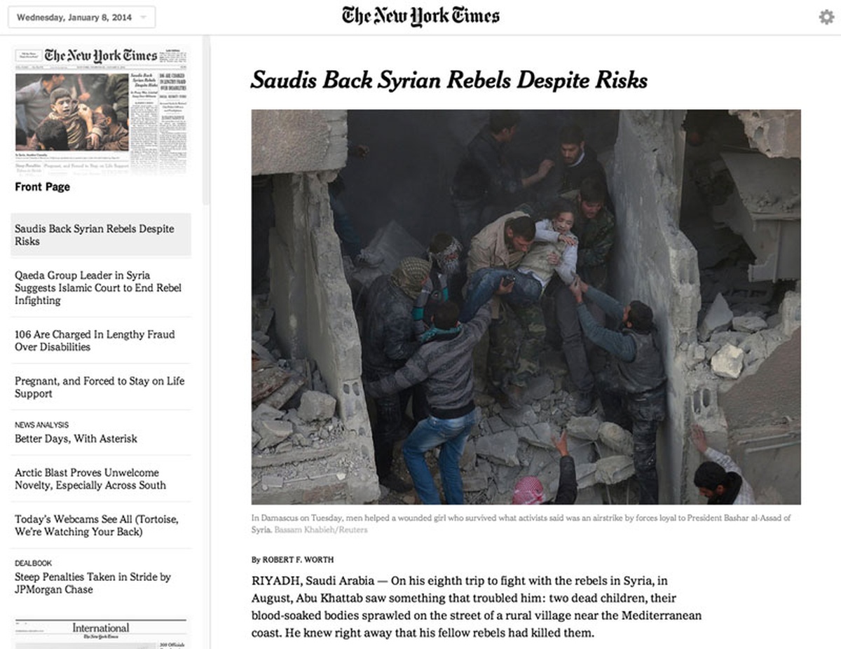
Inside Today’s Paper (app.nytimes.com), available to NYT subscribers.
Last month, while the team behind today’s NYT redesign were crunching away on final adjustments, another team at the Times launched Today’s Paper, an infinite-scrolling, offline-caching web app available to the paper’s subscribers. We spoke with three members of the team—a developer, a designer, and an editor—about the project’s challenges and ambitions.
Under the Hood
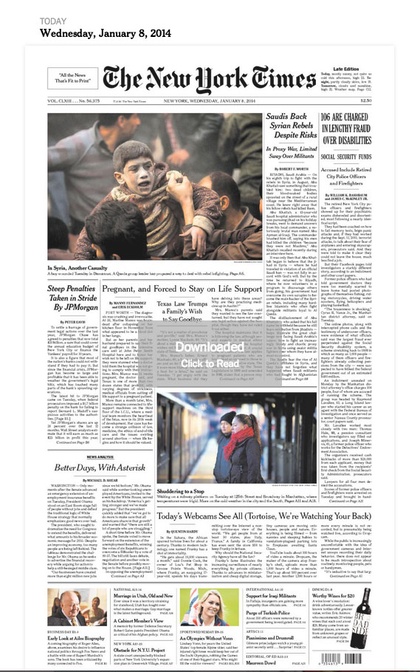
The issue-selection page.
What’s Today’s Paper made of? (Any interesting libraries or other components?)
Alastair Coote, Developer: I’d describe Today’s Paper as a client-driven webapp—over 90% of the overall code runs in the browser. It only interacts with the backend once a day, to download the latest issue and its related media. This means the whole thing works offline, storing the article data in a WebSQL or IndexDB database (depending on what the browser offers), and pushing that data through Backbone models into the views that render the final HTML.
On the presentation side, we’re using hammer.js to handle touch events on tablets, hardware-accelerated CSS transitions whenever and wherever we can, and good old jQuery to stitch it all together.
Q. What were the biggest tech challenges your team encountered while you were making it?
AC: Browsers. Or, rather, the number of them. Using the web as a development platform is hugely liberating because it means you can target multiple devices (iPads, Android tablets), which is great… until you realize how many browsers you have to support.
Native development has to contend with multiple versions of a platform, but with the web we have to contend with those different versions multiplied by the number of browsers available on each. Safari on iOS6 behaves differently to Safari on iOS7, which behaves differently to Chrome on iOS7, and so on. We try to be as data-driven as possible, so we’re keeping a close eye on how many people are using different combinations of browser and platform, and will focus our compatibility efforts accordingly.
What were the biggest design challenges you encountered as you built it?
Andrew Phelps, Assistant Editor: This is really a question for our designer, Kathryn Faulkner, so I won’t go into detail. The biggest design challenge was creating something that evoked the look and feel of our print newspaper without simply creating a replica edition. We had to bring the design forward. There are a lot of design elements in print (decks, sidebars) that provide context and weight to stories that do not carry over nicely to the screen.
Kathryn Faulkner, Digital Designer: The main design challenges we faced were 1) how to tie this product to the printed paper visually and 2) how to flatten the experience to promote efficient reading.
Our approach to #1 was to bring in images of the paper section fronts and to use a variety of typographic treatments and layouts.
To solve #2 we combined “endless” article scrolling on the right with persistent navigation on the left, making it possible to read the entire paper without the use of a “back” button.
How did you think about mobile vs. desktop (or small screen vs. big) as you made it?
AC: Kathryn can speak to this better than I can, but our work on Today’s Paper was informed by the HTML5 webapp, the Times Reader app and the web site’s Today’s Paper section, which are all big screen experiences- so we prioritized the mobile, big screen tablet experience from the start. That’s not to say we’ve forgotten about small screen experience though - we’ve been talking throughout the development process about how it could work on a smartphone, and hope to bring that to readers soon.
Why a Paper App?
We also asked Phelps to break down the editorial strategy behind the product and its conceptual relationship with other parts of the NYT world. He agreed to do so, with a preamble:
AP: I am just one person who worked on a great team to get this done—product owners (Michael Behr, Adam Lippman), a designer (Kathryn Faulkner), and developers (Ian Gardner, Alastair Coote, Kentaro Kaji, Diana Parrington). I served as the newsroom lead on the project, with help from fellow editor Seth Carlson. So that is to say this isn’t “my” product, nor am I trying to speak for everyone here.
Today’s Paper is a new product disguised as an old one.
I’ll start with an obvious premise: Print and screen are different media. For years, newspapers including mine have worked toward platform parity: getting all of the articles in print to look good on the web, then getting all of the articles on the web to look good on mobile devices (in that direction). In reality, true platform parity is impossible.
Real transformation will happen when we design for new platforms first, and accept the fact that some things simply don’t work on some platforms. And while I’m not speaking for my company here, I’m happy to witness this transformation happening at The Times. I think 2014 will be a banner year for new digital journalism.
But I think paper still has a lot of value. Paper—the paper—is an incredibly efficient medium for large quantities of text. It’s dense and rich with context. The paper provides for limitless, beautiful designs. It provides opportunities for serendipity—stumbling upon a wonderful piece of journalism you weren’t looking for. And the paper has bounds. It is an antidote to the endless stream.
There are digital thinkers in our business who seem to have demonized legacy platforms, paper chief among them. An app called Today’s Paper, in 2013, seems hopelessly backward. But we’re not trying to recreate the paper on the screen. We’re trying to recreate the things that people love about the paper on a screen: information density, serendipity, beautiful design, and bounds. (The Magazine, Evening Edition, O Globo, others are trying this.)
We built a very simple user experience: All of the articles appear one after another in a river; the user can scroll through the whole paper. Our brilliant designer, Kathryn Faulkner, drew from the visual language of the newspaper. The typography and photography in the app matches that in the print edition, where possible.
Obviously we gave the product a name and treatment that unmistakably links it to a legacy product. We borrowed from the wonderful visual language of the print edition for this product. We display scans of dress pages as a navigational aid. These are intentional choices to reach the many readers who still use and love the print edition—incidentally, readers who are older, are more loyal, and have more disposable income — while trying to move forward. Imagine if we renamed Today’s Paper to “The Morning News” and replaced the images of print pages with photos from the news. What’s left would be a beautiful, highly usable news reader that has really nothing to do with the print edition. If we stopped printing The Times tomorrow, this product would still be in good shape.
In my view Today’s Paper represents a transition for newspapers and news reading. It certainly does not replace our native apps on other platforms; it complements them.
Ed. note: This Q&A was lightly edited for clarity and house style.
Credits
-
 Alastair Coote
Alastair is a developer with the Guardian Mobile Innovation Lab, where he experiments with better ways to deliver news to mobile devices.
-
Kathryn Faulkner
Digital Designer at The New York Times
-
 Erin Kissane
Editor, Source, 2012-2018.
-
Andrew Phelps
Product at Apple in California. Former @nytimes editor, product director, and Innovation Report coauthor. Insta: phelpsomatic

